A great design system benefits the end customer, engineers, and designers.
Let’s assume that your design system has been approved because the design debt is obvious and your product is successful enough. The next step is to codify your best decisions into a system. We need to review all of the component properties: color tokens, component form, state management, nested components, and finally the primary component.
Color Tokens
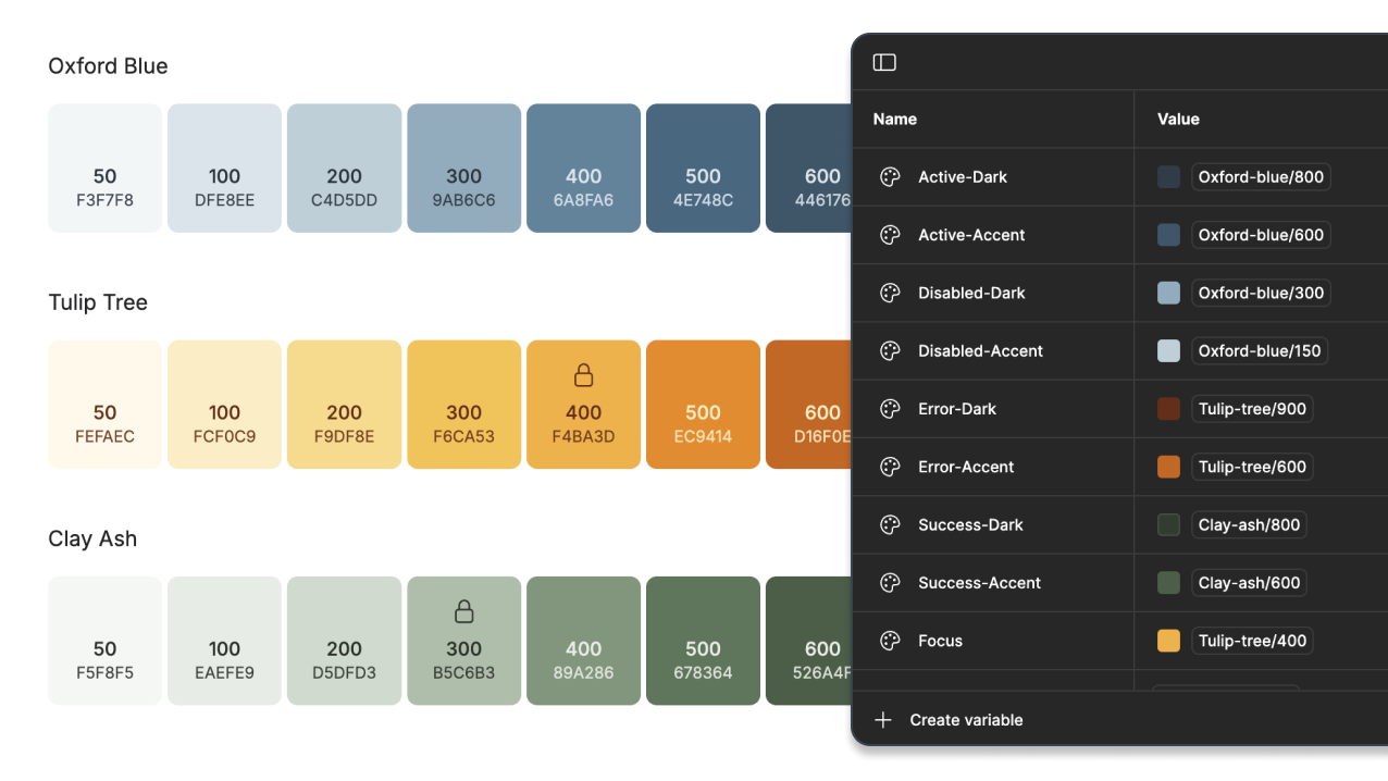
Figma’s precise tools for color tokens, spacing tokens, and state management, give modern UI designers granular control over the design enabling them to create a system of cascading decisions. Have you read the latest on creating color tokens? Conceptually this is what I’ll demonstrate, but scaling it back to just two layers of primitive and semantic colors.
When building out a design system, create a color ramp of primitive colors. Tailwind.css has popularized the ramp and there are plugins that can create the ramp for you. If your brand has a primary, secondary, and tertiary use those colors to start the ramp. Check out uicolors or tints to give it a try.
Component Form
To keep it simple, let’s analyze the common radio button. This is one of the most common web elements. Nearly the entire internet-using world has seen it used in a form. The standard html component does the basics, but does not come with thoughtful hover state, error state, or improved accessibility interactions.
Component form in a design system is more about how you communicate decisions in future edge case designs, less about how a standard html element works.
From a design perspective your team may not have set the standard for how the radio button should look and function according to your brand and accessibility goals. Products with mismatched design elements lack consistency.
When we’re done a feature designer can search the assets panel, drop in the component, and trust that all their options have been thoughtfully prepared for them.
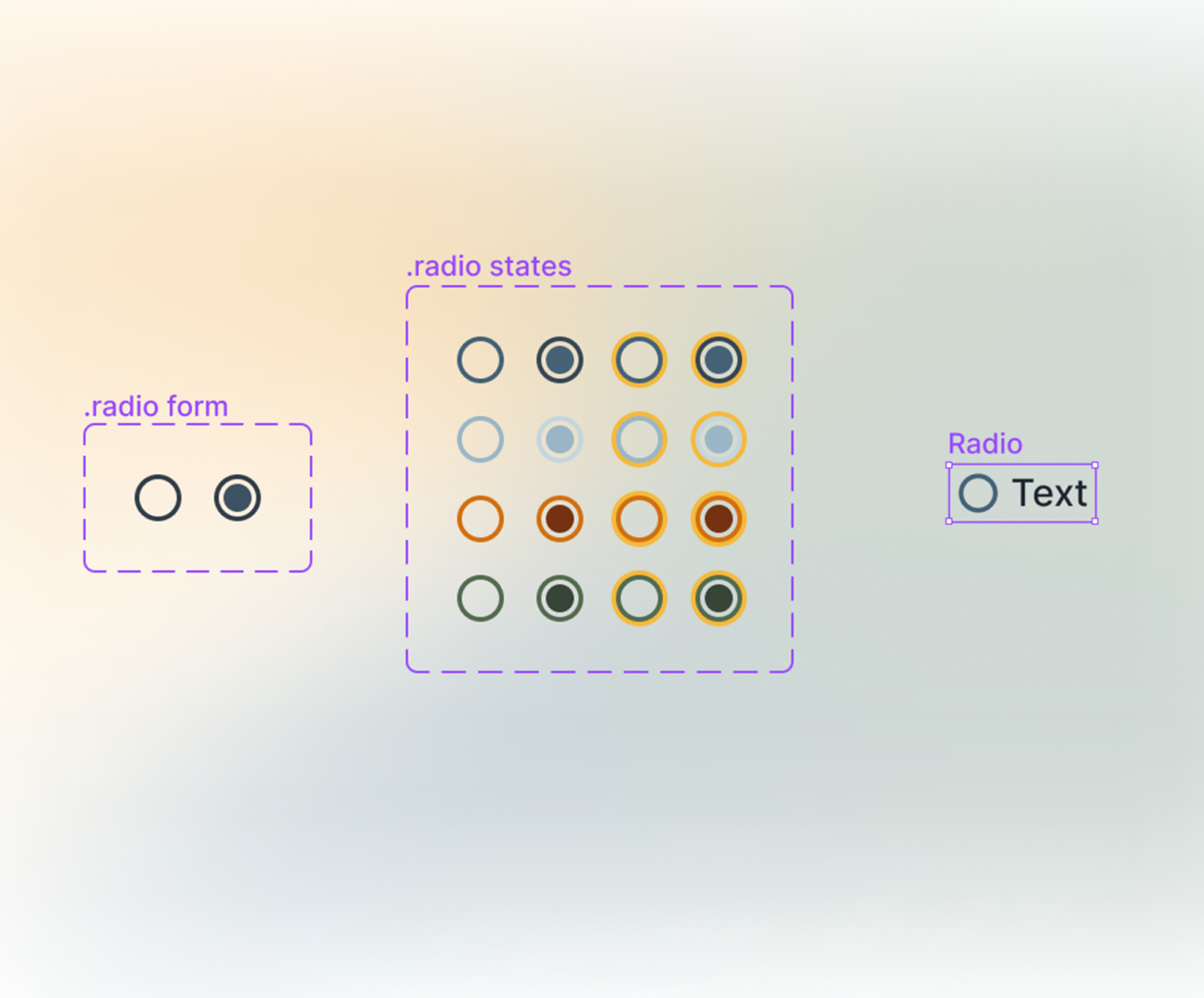
.Form ➡️.States ➡️ Primary Component
By isolating decisions and abstracting changes, we can ensure that upstream choices remain unaffected. To achieve this, each component can be constructed with a focus on Form, State, and Intent.
Form: The structural foundation of the component.
State: Every interactive element exists in multiple states—active, inactive, read-only, disabled, or focused.
Intent: Beyond form and state, a component must serve a clear purpose within the system.
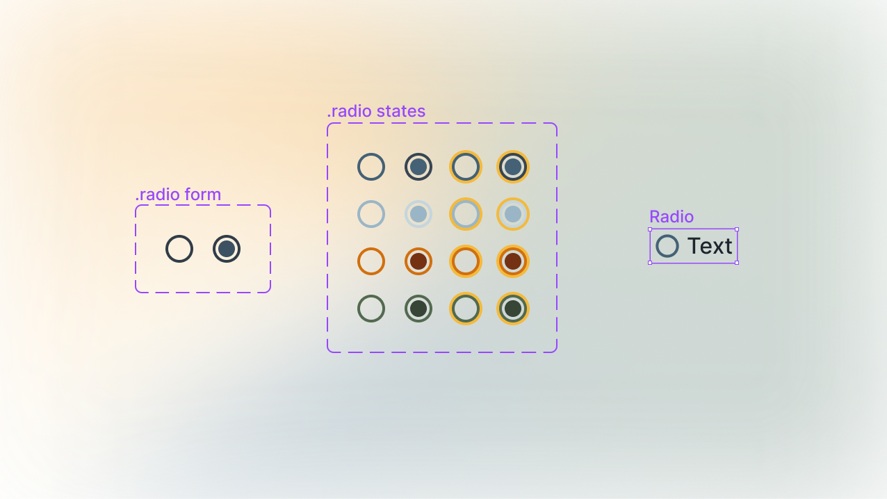
Build the .form to represent the unchanging shape of your component. A radio button has two shapes, un-selected and selected.
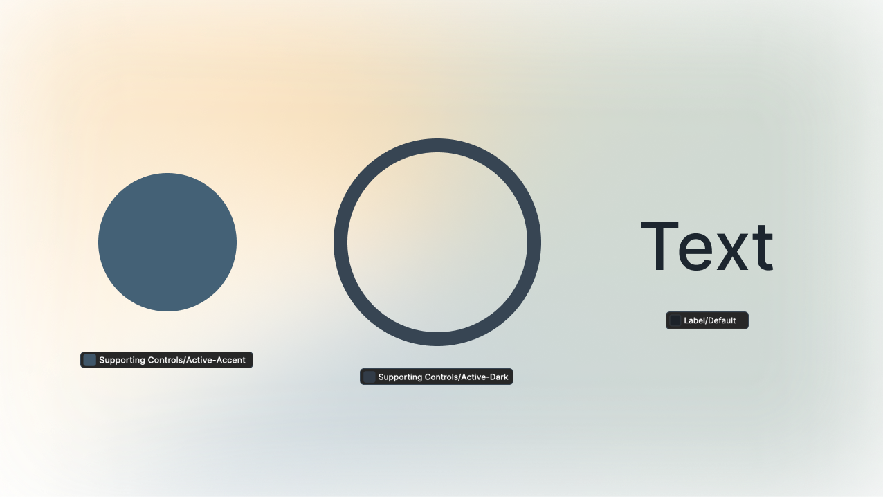
After building out the .form, apply the states. Use the .form to create the many states and convert it to a component of its own. Use your color ramp with semantic color tokens to assign color associations.
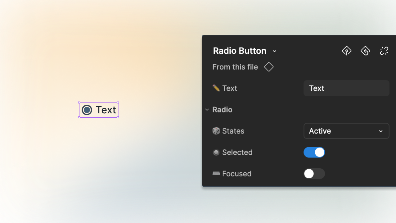
Use the .states to create a primary component. This will be the item that designers pick up. Turn on nested components and rename the layers in the layers panel to make the end designer experience even better! This makes the property panel meaningful to the incoming designer.
Nested instances control allows the properties to be adjusted from the primary component.
All components great and small
‟The animals always come first…〞 is a phrase coined by James Harriot, the main character in the PBS show All Creatures Great and Small, an animal vet in the Yorkshire Dales. Similar to the user experience designer’s mantra of ‟The user always comes first…〞.
Following these steps creates better components for your end users, engineers and designers.
Crafting a thoughtful and scalable system reduces inconsistencies, customer friction, engineering confusion, and enhances accessibility. Next time you refine a component, consider not just its aesthetic but its role in the broader system.
Every detail matters—great and small.
Loved the article? Hated it? Didn’t even read it?
We’d love to hear from you.