In the not-so-distant past, one of the top 10 debates in our field was over which print design tool worked best for our screen design needs. Thankfully, we’ve moved on and for a few years now we’ve had our pick of great design tools made specifically for the screen. Some of these options have even matured enough to present clear best choices for your particular style of work. Either way, the question of which tool is best is still the go-to conversational ice breaker for digital designers.
I’ve watched the evolution of screen design tools firsthand. While I haven’t followed every twist and turn, I have been picking up the new tools as they’ve come out and collaborated with different teams adopting different tools for over a decade.
My hot takes
| logo | tool | why you would use it |
|---|---|---|
| Sketch | You started using it a few years ago, you design alone, and you love plugins | |
| Figma | You need all the features and you need to collaborate with other designers on a regular basis. And you can’t remember what “off-line” means anyway. | |
| InVision Studio | You’re an early adopter and you need slick animations in your prototypes. | |
| Adobe XD | You are trying to get your money’s worth out of that Adobe subscription. You probably used to use Photoshop for screen design. | |
| Adobe Photoshop | 2006 called. They want their photo-editing software back. |
So which interface design tool should I use? Which is the best?
For a working professional, I think the real question is: Sketch or Figma? These are far and away the most serious contenders, but for history’s sake (and frankly, shameless SEO purposes) I’ll work through some of the others vying for the title.
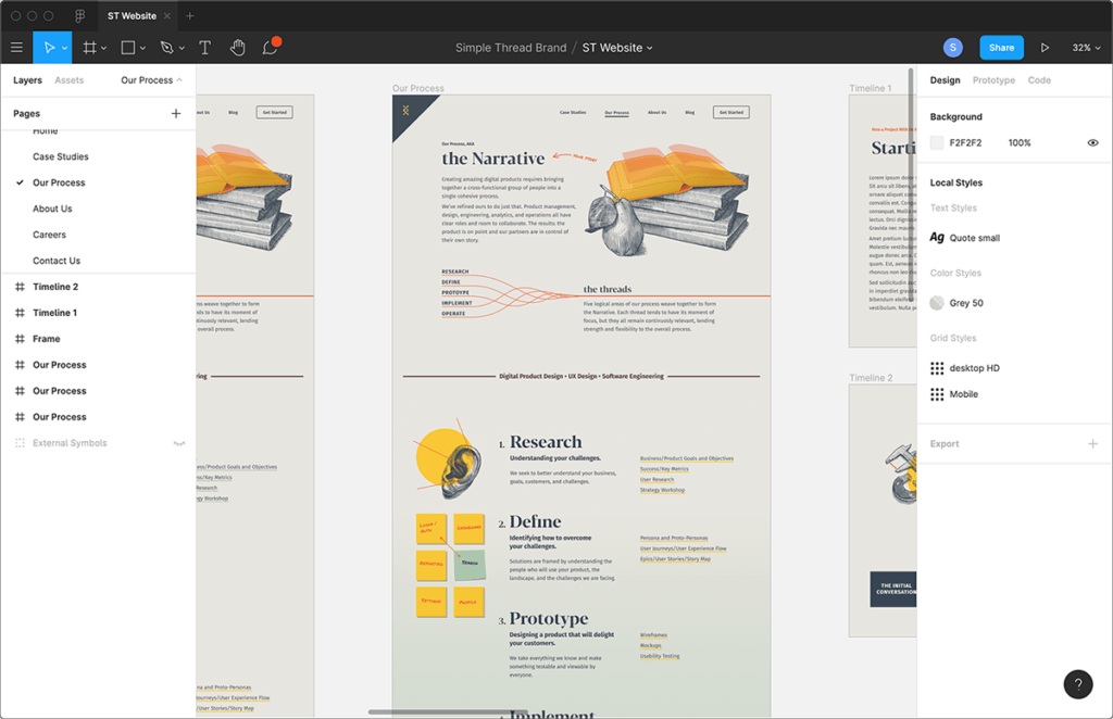
Figma

How did we get to be so lucky? Figma is such a well-designed product. It stands up against Sketch on every feature that really matters and then some, due to its browser-based approach. Collaboration within Figma is a true joy. As long as being online isn’t an issue, collaboration in a single file is instantaneous, seamless, and automatic.
If you’re just getting started as a digital interface designer, jump on in with Figma. If you’re working in a team of designers, I hope you’re already using Figma; otherwise, you’re dealing with a fair amount of unnecessary pain. They have a lot of momentum and a history of consistently rolling out useful, well-thought-out features. Alongside the best environment for collaboration they have great prototyping and sharing tools — though to be fair, the prototyping and sharing took me a minute to wrap my head around after being a Sketch user. Shared libraries also work very well. At Simple Thread we’re using our brand system library to drive our own print document and presentation designs as well — all in Figma!
To make the switch from Sketch smoother, it’s easy to import Sketch files with most of the components intact. I recently imported IBM’s Carbon design system Sketch files into Figma. With only about 20 minutes of tweaking, I was able to use it as a library for a Carbon-based project.
If you are coming from Sketch, you’ll see that Figma’s components and styles are quite different, but they are very well thought out and once you get your head around how they work, you won’t look back.
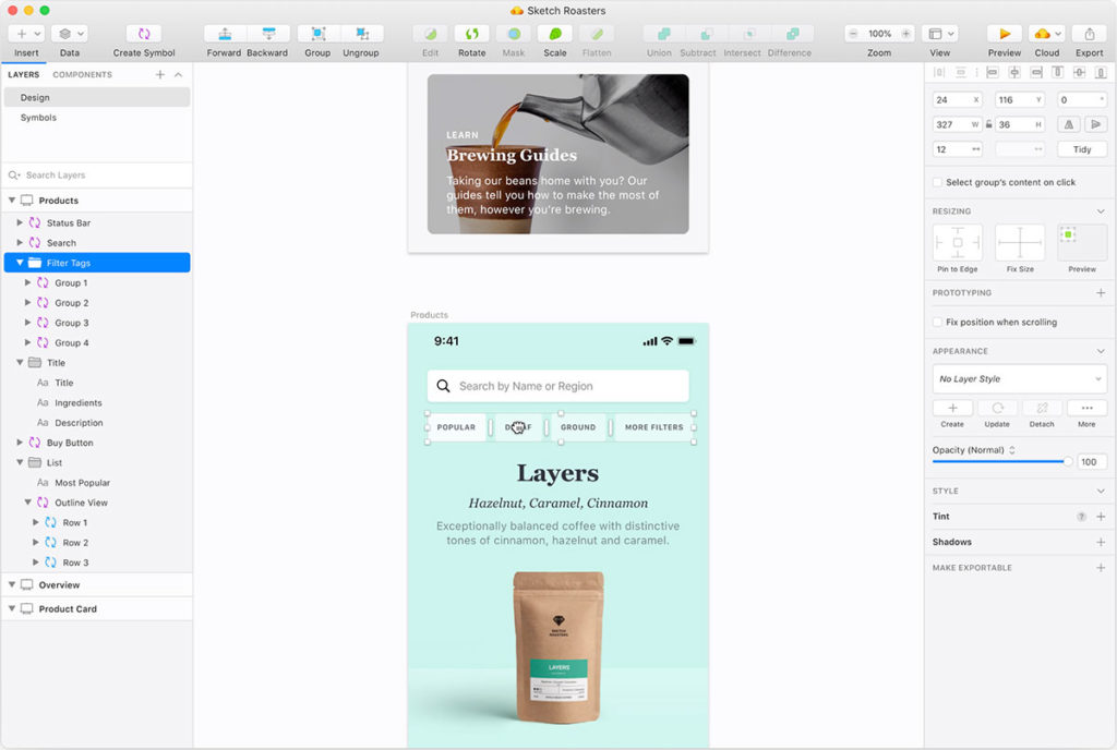
Sketch

We owe so much to the product team that launched and pushed Sketch in its first few years. Other groups were trying, but the Sketch team was really responsible for the great migration of UI and UX designers away from Photoshop and into a real interface design program. I think they could have achieved similar results with a much less robust, feature-rich, and high quality product, but Sketch went above and beyond and gave us a visionary initial product that changed the industry.
If I had the luxury of letting brand loyalty dictate my toolkit, I’d still be a dedicated daily Sketch user. BUT, I’ve got stuff to do and a team and clients to collaborate with and Figma is just better for collaboration with clients and fellow designers. For collaboration in Sketch, you have to worry about version control and/or shared file storage and you have to add on something like Abstract. Not fun.
Prototyping is pretty good now, but for a while there I relied on plugins like Craft and the InVision App. If you have a complex project with a lot of features to prototype, you might still want to look at using InVision’s prototyping plugin for Sketch; it gives a better client viewing experience with commenting and notation.
Also, Zeplin has been a great experience for sharing Sketch files with developers. I think is still somewhat preferred over Sketch’s own sharing tools. In a way, Sketch’s initial reliance on strong plugins such as InVision and Zeplin for prototyping and developer views has cannibalized their own versions of these same features.
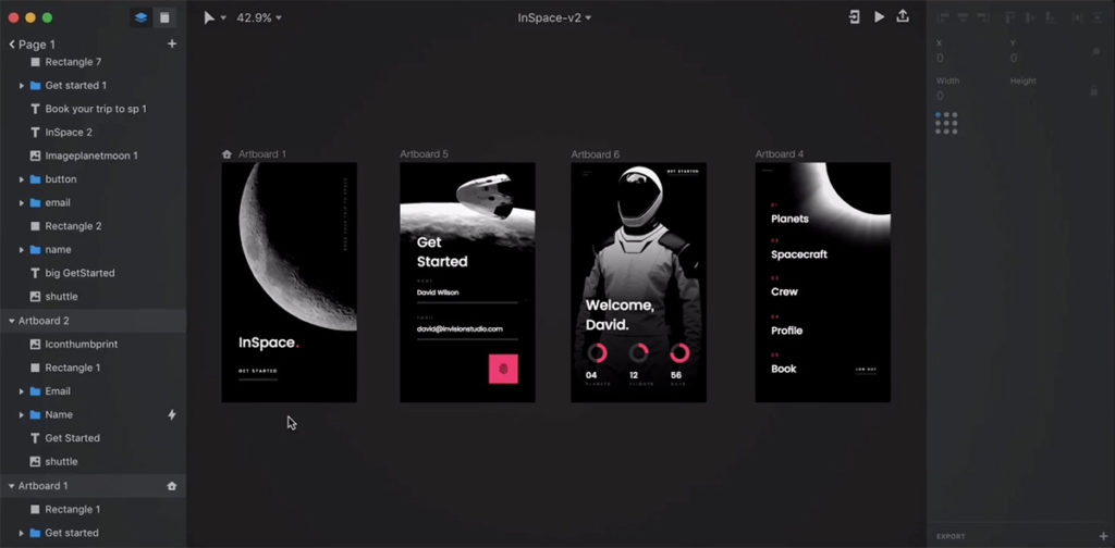
InVision Studio

InVision Studio — the interface design tool, not the collaboration suite — had a bit of a rocky rollout from 2018 to 2019. It seems to be on its feet now, but because of that rocky start, I haven’t spent much time with it and I haven’t worked with any team who has. The prototyping — specifically the animation — looks to be its real strength. But somewhat ironically, considering InVision’s brand and history with collaboration tools, the collaboration in Studio just doesn’t hold up against Figma.
I still have a lot of respect for InVision as a brand, and I wonder about the story behind this rollout. Maybe they can catch up with the remaining features and be a real professional option soon.
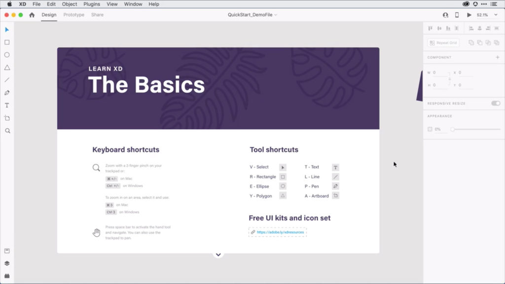
Adobe XD

Remember when Photoshop was the best program for digital interface design? No you don’t, because it never was. Illustrator and even InDesign were better options because they at least had tools that prioritized shapes and text, two of the main building blocks of digital interfaces. Photoshop always prioritized image manipulation tooling. (And if that was a good formula, we might as well have tacked a few features onto MS Paint and called it an interface design program…)
But I do remember the nightmare years when everyone was using Photoshop for interface design anyway. Over the course of years and miles and miles of forum threads touting Photoshop as the go-to program for screen design, Adobe still kept Photoshop’s feature set mostly focused on image editing and declined to release a serious screen design solution! I have to believe that Adobe saw the huge opportunity but either convinced themselves that it would undermine their existing products or that it was somehow a limited audience. Whatever the reason, they sat on it. Eventually the scrappy group behind Sketch came along and a ton of Photoshop users defected to Sketch.
That background is why I’m pretty dismissive of XD. It was purely a reaction to Sketch. XD functions like it was hastily Frankenstein-ed together from the existing Adobe Suite, lumbering along slowly under the weight of a complacent, out-of-touch software company. It always seemed to be a handful of crucial features behind Sketch and it will never be free of the Adobe Suite’s shared context.
If you didn’t grow up using Photoshop and Illustrator, you’ll probably scratch your head at the tool and feature organization within XD, but they are the way they are because that’s how it has always been done in the rest of the Adobe Suite. I have fundamental doubts that Adobe will ever be able to prioritize user needs over business needs or even attempt to find the common ground between the two.
Conclusion
Go get on Figma. I wish they were paying me for the endorsement, but truly it’s just a great tool. Do your due diligence though, and check out the other tools, almost all of them offer free trials.
Revisiting this topic has reminded me of how interesting I find the simple activity of making tools. Software designers designing software that helps them design software. Carpenters crafting woodworking tools that help them make things. Robots designing and creating Von Nuemann probes. I’m drawn to the luxurious self-indulgence of the activity. Toolmaking sits at the pinnacle of a discipline, often requiring an expert level of skill, but almost no research or empathy. When making a tool, often you are the end-user. Making a thing for yourself dodges so much of the risk, challenge, and effort involved in understanding someone else’s needs. I wonder how the satisfaction of building something for yourself compares to the satisfaction of building for others…
I’m off to dig up some podcasts on creating Figma.
Loved the article? Hated it? Didn’t even read it?
We’d love to hear from you.


