Design fidelity can be a hard concept for clients to understand. The process of turning ideas into product looks different among designers and design teams, and that can feel particularly mysterious to a client who has their own internal visualization of what a final product may look like. So how do we as designers move through the fidelity spectrum in a way that serves our own creative process, but also brings the client along in a way that’s productive, collaborative, and efficient?
First, let’s define what we mean by fidelity in product design. Fidelity is much more than a measure of how visually close you are to the end product. Fidelity can cover many things, including how concrete the content is, how much of the product the wireframe/mock-up covers, and how deep we go into the various interactions on the page.
Many teams follow a straight line through the fidelity spectrum, stopping at three specific places along the way.
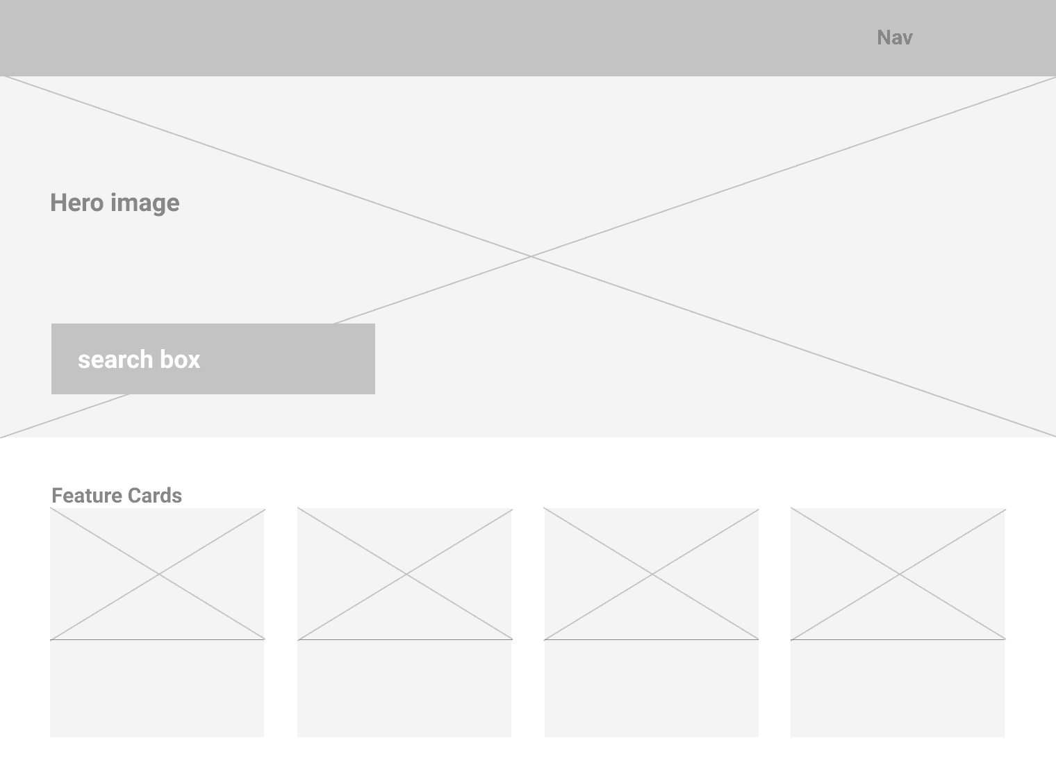
- Low Fidelity Wireframes – Things are loose. Think gray boxes, lines representing text, and simple shapes to get the very basic layout and concept down quickly

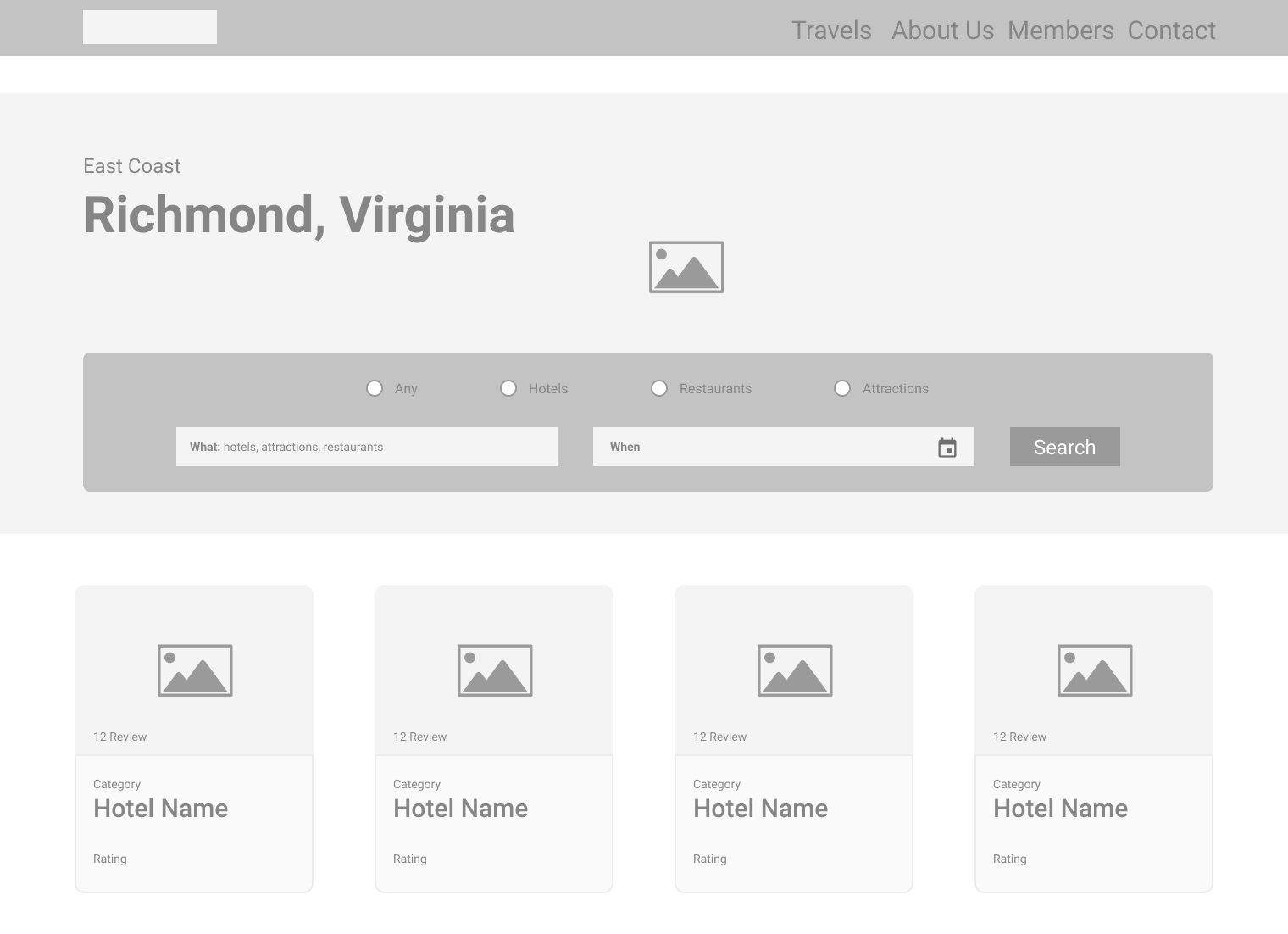
- Mid Fidelity Wireframes – The design starts to get tightened up at this stage and things come into focus a bit more. The lines used to represent text are replaced with actual placeholder text, the hastily drawn boxes are gone and in their place are the x-ed out squares calling out where images will live. The overall hierarchy of the items on the screen are starting to take shape.

- High Fidelity Mockups – The decisions have been made, the stakeholders have agreed and it’s time to polish it up and send it off to the magical land of development!

For some projects, this process works great. Maybe you have a client who understands very clearly what’s being laid out in front of them and can make decisions based on the deliverables you’ve shown them. But not every project or client is the same, which means that this process is by no means a one-size-fits-all solution.
Now, with all that out of the way, let’s make something clear. We’re not saying that low fidelity wireframes aren’t a very good place to start. In fact, that’s where a project starts 99.9% of the time. The fastest way to iterate through ideas as a designer is to sketch it out. Get it out of your head and onto paper or a digital file, or even draw it in the dirt—anything as long as it’s in a format that can be shared, modified, and iterated on. The critical issue here is that, for many designers, they never return to this level of fidelity in a project.
What’s key is to not get locked into only moving progressively through the fidelity spectrum. Low fidelity wireframes aren’t always easily understood by clients outside of the product design field so it may be more helpful to present them with something more fully formed. Other times, you may have pushed on to higher fidelity wireframes or even mockups only to realize that requirements have changed and you need to move back down the fidelity spectrum, to quickly iterate based on those changes. Use the various levels to your advantage—to meet your team’s creative needs, and to further the collaborative process with your client.
It can also be helpful to use a mixed approach if that meets your needs. At some point in your project, you may have different features at different levels of completion sharing a single screen. Utilizing various levels of fidelity here can help provide a clearer view of one feature while keeping the other features loose, or even just holding space for a feature that will be developed later. Moving through the fidelity spectrum this way allows you to better handle rapid changes to a project and enables you to see if your solutions are meeting the user’s needs.
Projects and clients vary wildly and there’s no single combination of wireframes and mockups that will always be right. Some move incrementally through the fidelity spectrum, some flex up and down as required, while others may make huge leaps from one end of the spectrum to another. Your goal as an experienced designer is to be able to use the various levels of the design fidelity spectrum as a flexible tool to be able to communicate clearly with your client and to serve your team’s creative needs.
Loved the article? Hated it? Didn’t even read it?
We’d love to hear from you.


