
Here at Simple Thread, our workflow for creating and using SVG icons has been consistently iterated on with each new project. We’ve reached a point where we’ve got something solid that’ll work universally for all of our projects, whether they’re using Vue.js, Rails, Django, Node.js, or no framework at all. It uses web standards and no external libraries to prioritize small file sizes and load times for a great user experience, while keeping icons easy to style and use in the app for a great developer experience.
Preparing Icons for Export in Figma
Before we can use our icons in production, we’re going to need to do a bit of prep work. We want to make sure that our icons scale well, can have their colors and dimensions easily changed with CSS, and have the smallest file size possible without visual degradation.
Even if the icons in your project aren’t hand-crafted by designers, and you’re using something like Google’s Material Design icons that may seem production ready, you might need to do a bit of prep work for those as well.
Outlining Strokes
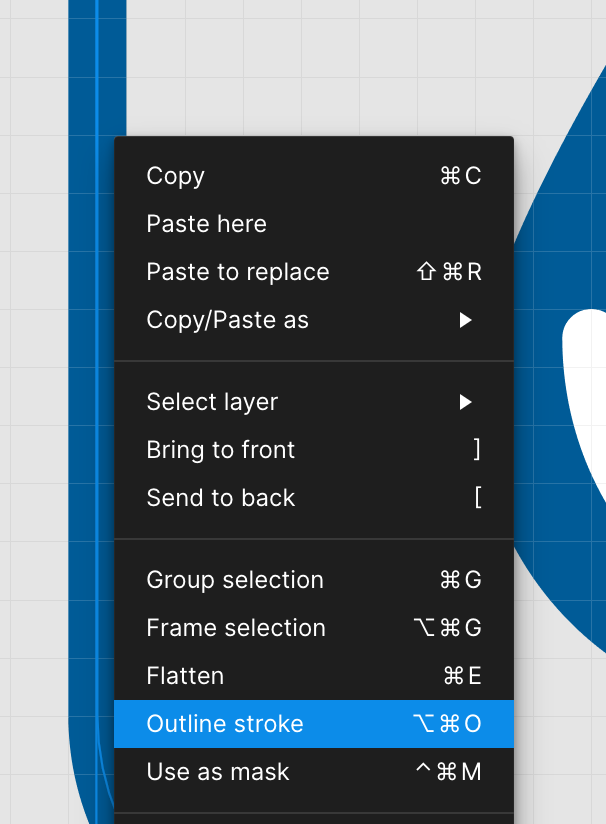
Although icons with strokes should render it appropriately in the browser, for ease of use in Figma, we want to outline all of our strokes.
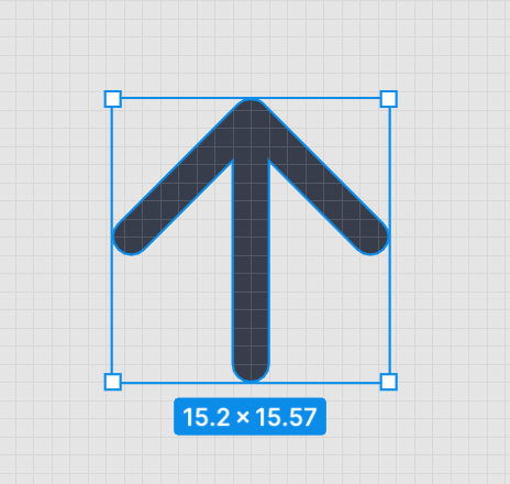
When you’ve got a small 24px by 24px icon, a 1px stroke can look really great. But, when we start using those icons at different sizes, the 1px stroke doesn’t keep the same ratio it had and can start to become too thin or too thick.
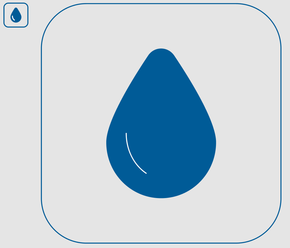
For instance, here’s an icon that looks correct on the left, but when enlarged by 10x, the outline for the water drop’s shine and border become too thin.
This can easily be done in Figma by right-clicking on the stroke and choosing “Outline stroke”.
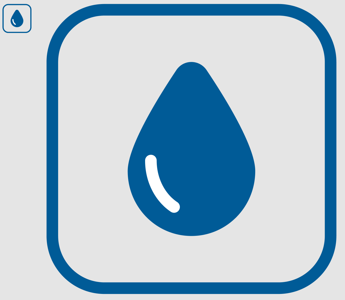
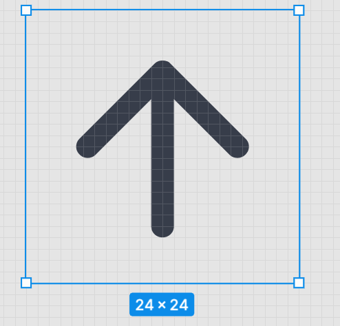
And now when we scale it up 10x, it looks how we expect.
Check Icon Sizing
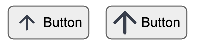
One issue that a developer might run into when implementing the icons is that the icons are inconsistently sized. For example, if you have a button component with an icon, you’re going to want to easily swap out the icon you’re using and keep things consistently sized. You don’t want to run into a situation where you’ve exported an icon without padding and have to resort to CSS hacks to change its size because it’s visually too big compared to other icons.
Here’s an example of the same icon on a button, but one was exported without padding around it.
From my experience, it’s best to choose one particular frame size in Figma and export the frames as SVGs, not the icon paths themselves.
If an icon starts to feel too small when you’re using it, change the size in Figma and re-export it.
Grouping Paths
One final bit of prep we can do is grouping our paths together. One of the reasons we do this is so that icons are easier to style, the other is to reduce the file size.
What do we mean by grouping paths?
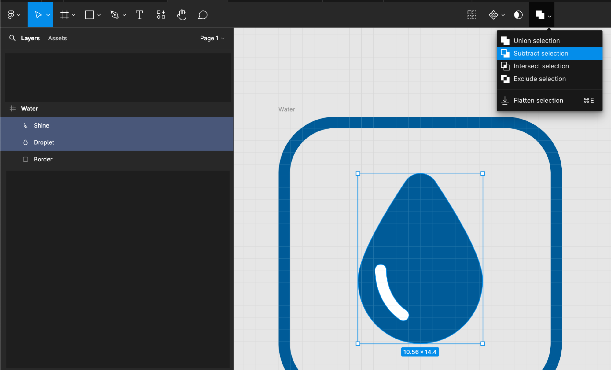
If you select your icon’s frame in Figma, you should see a menu in the top bar called “Boolean Groups.” Almost always on projects I’m on, we want the icons to all be one solid color. In order to make that easy, I use different boolean grouping operations to get everything down to one single group.
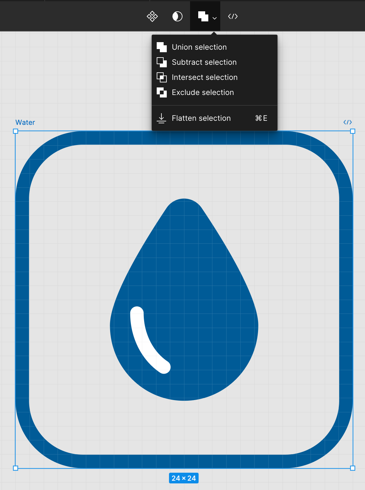
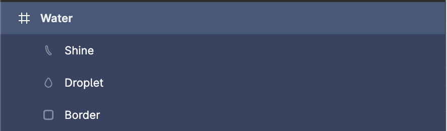
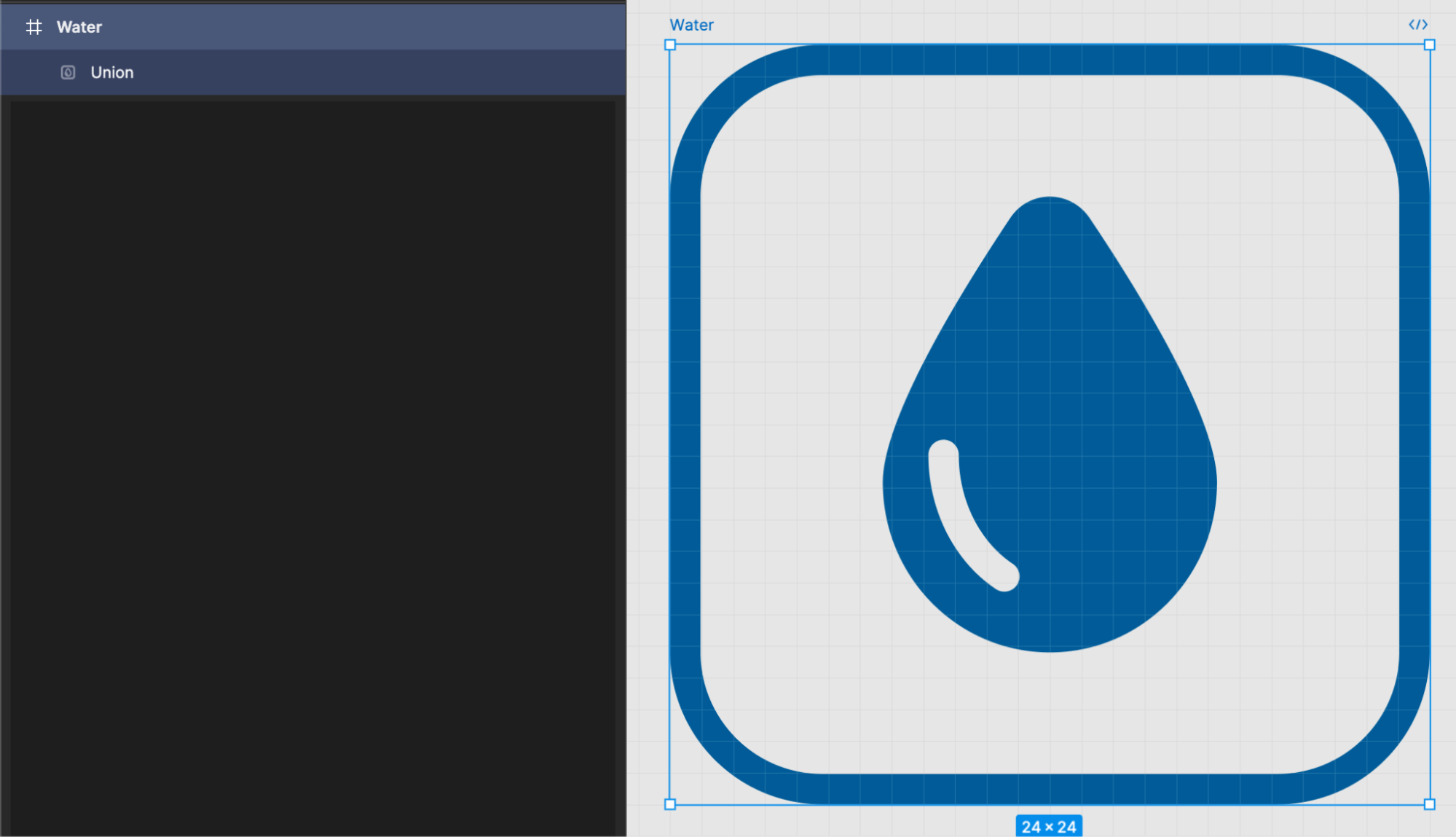
In this case, we’ve got three layers to our water icon: Shine, Droplet, and Border
Right now the shine is pure white, which is okay-ish, but if we ever want to change the background on these icons, we’re probably going to want the shine to actually be transparent. So to achieve that, we’ll want to cut it out from the Droplet layer using the “Subtract selection” option.
We’ll make sure the Shine layer is above the Droplet layer, select both, and then select “Subtract selection” from the Boolean groups options.
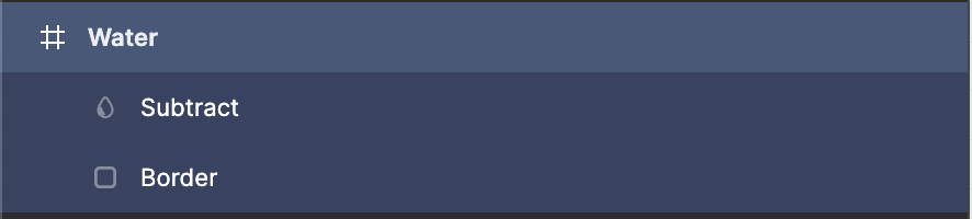
And then with the new Subtract layer and Border selected, we’ll choose “Union selection” to create a single path.
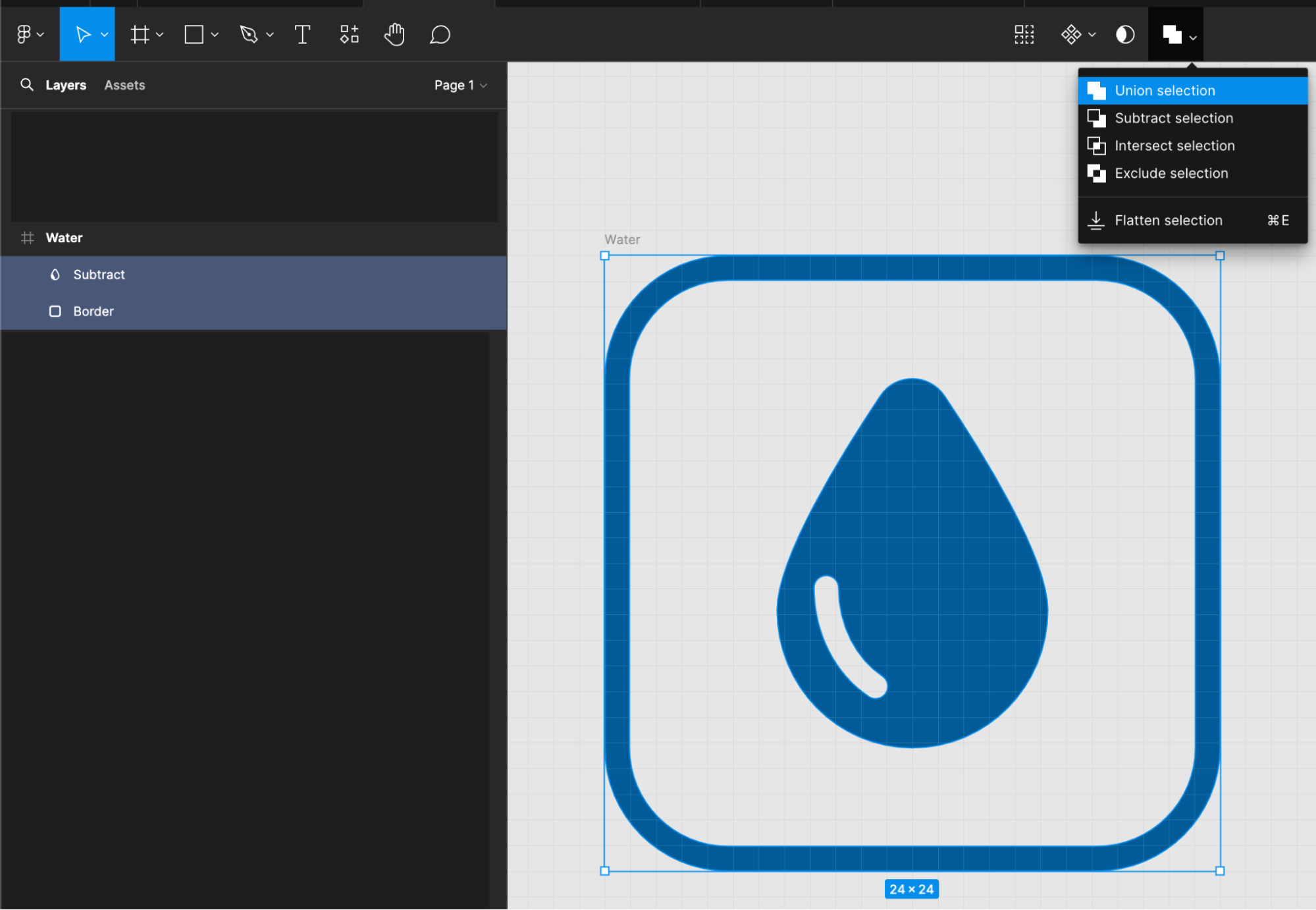
Now we’ve only got one path we need to color, and our file size even got smaller! Even with an icon as simple as this, we’ve gone from 1,178 bytes to 1,084 bytes by simply grouping paths together. For more complex icons with masks and whatnot, you can really shrink the file size by quite a bit.
It’s important to keep in mind that not everybody is going to be using your app on a fast connection, so every byte counts!
Exporting and Optimizing Icons
Now, here’s a step-by-step on how we actually export and optimize our icons.
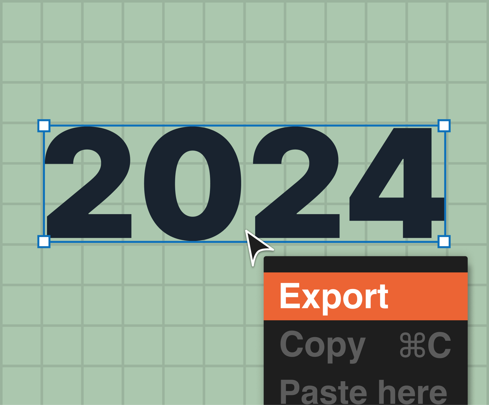
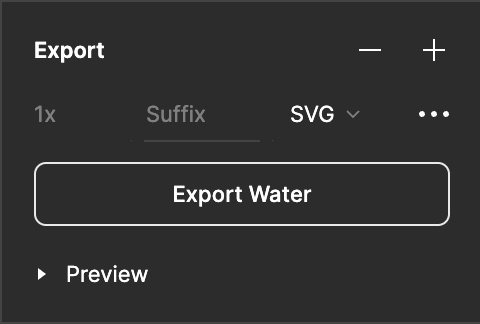
1. Find the icon we need to export in the Figma design and click it to highlight it in the layers panel. We want to select the frame, not the vector path inside of the frame.
2. With the frame selected, you can press the “+” icon in the Export panel in the bottom right of Figma. This opens up a new panel where you can modify the file type of the export. Change this from “PNG” to “SVG” and click “Export [Layer Name]”. In our case, it says “Export Water.”
3. Once the SVG icon is saved to your computer, go to https://jakearchibald.github.io/svgomg/ and click “Open SVG” in the left panel to import the icon. You can zoom in with your mouse wheel to get a better look. We’ll want to get the file size as small as possible, so we’ll start by moving “Number precision” down to the lowest value. Unfortunately, when we go to the lowest precision the icon becomes warped.
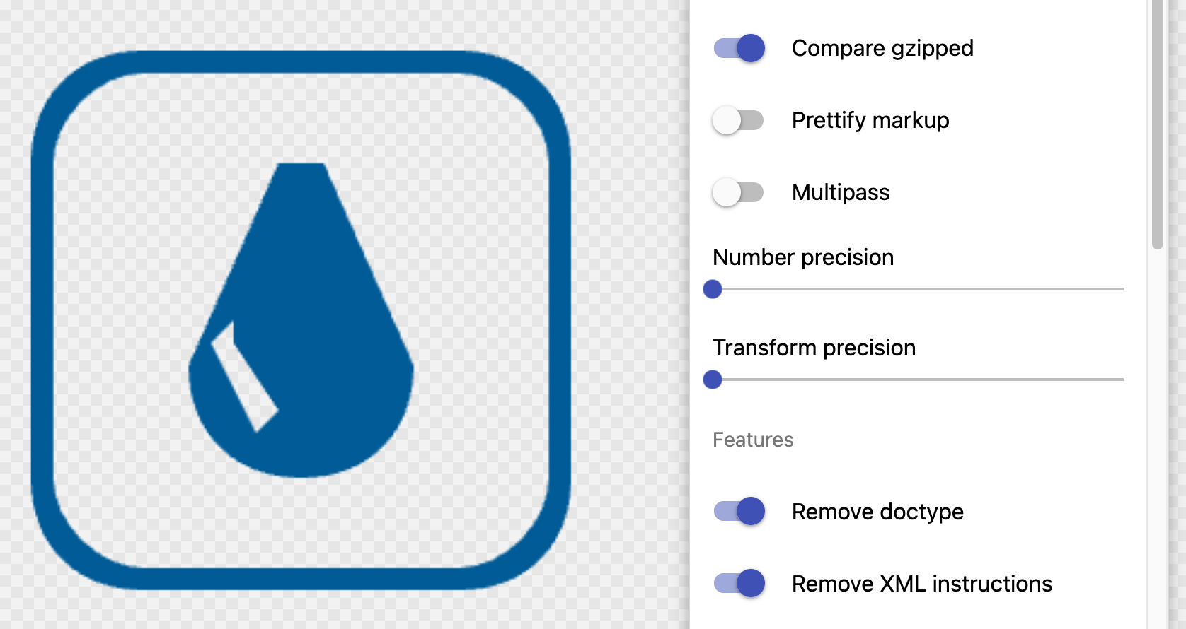
4. Incrementally increase the precision so that when you toggle on and off the “Show original” option in the top of the list, you can’t see any difference between the two. In our case, we had to set “Number precision” to “2.”
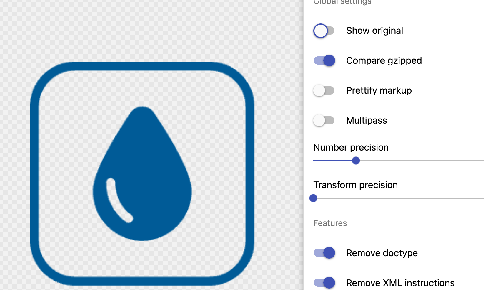
5. Scroll down the right-size panel until you get to “Remove viewBox” and make sure it’s toggled off.
6. Click the teal blue “Download” button to save the compressed SVG to your computer.
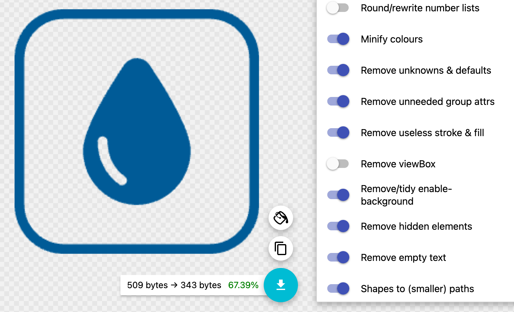
By grouping the paths and optimizing our SVG, we’ve gone from 1,178 bytes to 661 bytes. ~44% smaller!
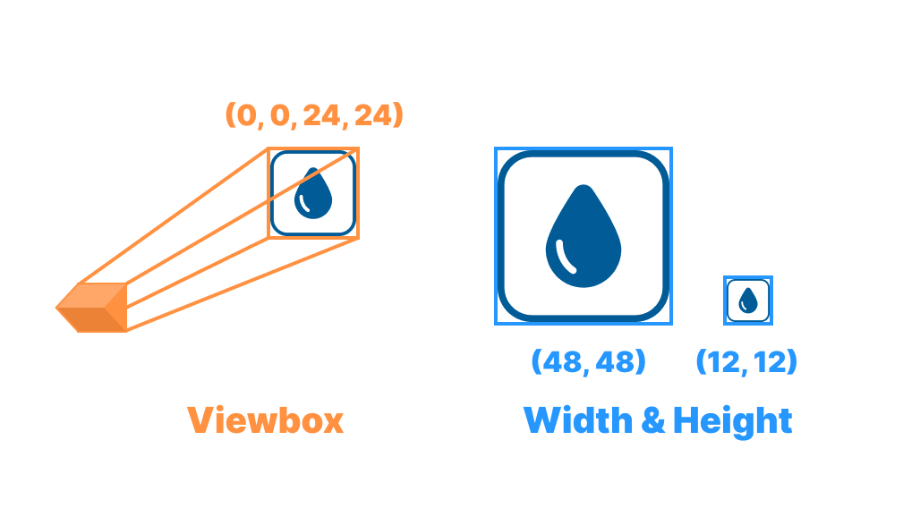
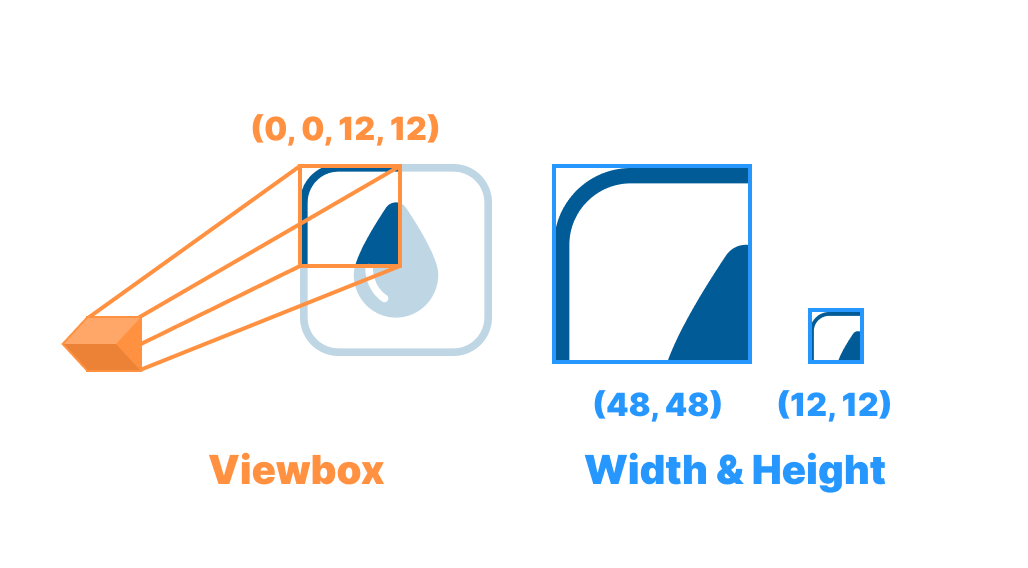
What’s viewBox?
In Step 5 we turned “Remove viewBox” off, and increased our file size. If we’re trying to optimize our images, why did we do that?
If we keep viewBox then we can set width and height with CSS, and keep our aspect ratio.
The best way to think about the viewBox attribute is like a camera. You can set the position attributes to change where it’s looking, and then its dimensions to zoom in and out.
The width and height attributes are like the size of your TV. Whether you view a movie on your TV or your phone, you can always see everything that the camera recorded, it just takes up a larger or smaller amount of physical space.
Some people recommend always having a set width and height attribute on your SVGs just in case the CSS fails to load so your icons aren’t super large. But that’s up to you.
Using SVG Icons in Production
After you’ve exported all of your icons, now you’ve got to get them into your app.
The technique we’re going to use is something that I came across in this wonderful article called Breaking Up with SVG-in-JS in 2023, but it’s at least a decade old. If you’re using a library like svgr or vue-svg-loader to give yourself better DX (Developer Experience) by loading in SVG icons as components, then you’re increasing the JavaScript bundle size so it takes longer to download and the JavaScript engine has to parse and compile more JavaScript which will make everything take longer to load, overall making your app have worse UX (User Experience).
So how do we get better UX while keeping the DX? By using an SVG sprite sheet. We’ll create a single SVG file, and put all of our icons inside it as <symbol>s.
Our exported and optimized SVG looks something like this:
<svg viewBox="0 0 24 24" fill="none" xmlns="http://www.w3.org/2000/svg">
  <path fill-rule="evenodd" clip-rule="evenodd" d="M.96 4.81A3.85 3.85 0 0 1 4.81.96h14.38a3.85 3.85 0 0 1 3.85 3.85v14.38a3.85 3.85 0 0 1-3.85 3.85H4.81a3.85 3.85 0 0 1-3.85-3.85V4.81ZM4.81 0A4.81 4.81 0 0 0 0 4.81v14.38A4.81 4.81 0 0 0 4.81 24h14.38A4.81 4.81 0 0 0 24 19.19V4.81A4.81 4.81 0 0 0 19.19 0H4.81Zm12.47 13.83A5.33 5.33 0 0 1 12 19.2a5.32 5.32 0 0 1-5.28-5.37c0-2.03 2.46-6.02 4.03-8.35.6-.9 1.9-.9 2.5 0 1.57 2.32 4.03 6.32 4.03 8.35Zm-8.64-1.35c.27 0 .48.21.48.48 0 1.5.7 2.78 1.7 3.44a.48.48 0 0 1-.53.8 5.07 5.07 0 0 1-2.13-4.24c0-.27.22-.48.48-.48Z" fill="#005B97"/>
</svg>
Step one, is we want to set the fill attribute to currentColor. This unlocks the ability to use the CSS color attribute to change the color of the icon. No need to export different icons for each separate color we need.
And, as a bonus, we can take advantage of CSS transitions and gracefully change the color of the icon for times like when an icon inside of a button needs to change color on hover.
<svg viewBox="0 0 24 24" fill="none" xmlns="http://www.w3.org/2000/svg">
  <path fill-rule="evenodd" clip-rule="evenodd" d="M.96 4.81A3.85 3.85 0 0 1 4.81.96h14.38a3.85 3.85 0 0 1 3.85 3.85v14.38a3.85 3.85 0 0 1-3.85 3.85H4.81a3.85 3.85 0 0 1-3.85-3.85V4.81ZM4.81 0A4.81 4.81 0 0 0 0 4.81v14.38A4.81 4.81 0 0 0 4.81 24h14.38A4.81 4.81 0 0 0 24 19.19V4.81A4.81 4.81 0 0 0 19.19 0H4.81Zm12.47 13.83A5.33 5.33 0 0 1 12 19.2a5.32 5.32 0 0 1-5.28-5.37c0-2.03 2.46-6.02 4.03-8.35.6-.9 1.9-.9 2.5 0 1.57 2.32 4.03 6.32 4.03 8.35Zm-8.64-1.35c.27 0 .48.21.48.48 0 1.5.7 2.78 1.7 3.44a.48.48 0 0 1-.53.8 5.07 5.07 0 0 1-2.13-4.24c0-.27.22-.48.48-.48Z" fill="currentColor"/>
</svg>
The next step is to change the <svg> tag into a <symbol> tag.
<symbol viewBox="0 0 24 24" fill="none" xmlns="http://www.w3.org/2000/svg">
  <path fill-rule="evenodd" clip-rule="evenodd" d="M.96 4.81A3.85 3.85 0 0 1 4.81.96h14.38a3.85 3.85 0 0 1 3.85 3.85v14.38a3.85 3.85 0 0 1-3.85 3.85H4.81a3.85 3.85 0 0 1-3.85-3.85V4.81ZM4.81 0A4.81 4.81 0 0 0 0 4.81v14.38A4.81 4.81 0 0 0 4.81 24h14.38A4.81 4.81 0 0 0 24 19.19V4.81A4.81 4.81 0 0 0 19.19 0H4.81Zm12.47 13.83A5.33 5.33 0 0 1 12 19.2a5.32 5.32 0 0 1-5.28-5.37c0-2.03 2.46-6.02 4.03-8.35.6-.9 1.9-.9 2.5 0 1.57 2.32 4.03 6.32 4.03 8.35Zm-8.64-1.35c.27 0 .48.21.48.48 0 1.5.7 2.78 1.7 3.44a.48.48 0 0 1-.53.8 5.07 5.07 0 0 1-2.13-4.24c0-.27.22-.48.48-.48Z" fill="currentColor"/>
</symbol>
Then we’ll want to add a unique id to it. This will allow us to grab the exact icon we want from our sprite sheet. I’ve been namespacing all of the ids with “icon-” and then using a literal name of what the icon is, rather than the semantic meaning.
So, for an icon that’s a picture of a trash can, I’d give it an id of icon-trashcan rather than icon-delete, even if it’s only used semantically to mean delete. By just reading the code you can know what’s displayed.
Plus, who knows if later down the line you’ll need to use it semantically in a way other than “delete.” Perhaps you need an icon next to a count of how many trash cans there are in a building. Using an icon called “delete” doesn’t make much sense.
In our case, we’ll give this an id of icon-raindrop.
<symbol id="icon-raindrop" viewBox="0 0 24 24" fill="none" xmlns="http://www.w3.org/2000/svg"><path fill-rule="evenodd" clip-rule="evenodd" d="M.96 4.81A3.85 3.85 0 0 1 4.81.96h14.38a3.85 3.85 0 0 1 3.85 3.85v14.38a3.85 3.85 0 0 1-3.85 3.85H4.81a3.85 3.85 0 0 1-3.85-3.85V4.81ZM4.81 0A4.81 4.81 0 0 0 0 4.81v14.38A4.81 4.81 0 0 0 4.81 24h14.38A4.81 4.81 0 0 0 24 19.19V4.81A4.81 4.81 0 0 0 19.19 0H4.81Zm12.47 13.83A5.33 5.33 0 0 1 12 19.2a5.32 5.32 0 0 1-5.28-5.37c0-2.03 2.46-6.02 4.03-8.35.6-.9 1.9-.9 2.5 0 1.57 2.32 4.03 6.32 4.03 8.35Zm-8.64-1.35c.27 0 .48.21.48.48 0 1.5.7 2.78 1.7 3.44a.48.48 0 0 1-.53.8 5.07 5.07 0 0 1-2.13-4.24c0-.27.22-.48.48-.48Z" fill="currentColor"/></symbol>
Composing the Spritesheet
Next, we’ll want to create our icon file. You can put this wherever your other assets are. We’ll call ours icon.svg.
It will start out with merely an <svg> tag with a <defs> tag inside of it.
<svg><defs></defs></svg>Then we’ll put our icon inside of the <defs>.
<svg>
  <defs>
    <symbol id="icon-raindrop" viewBox="0 0 24 24" fill="none" xmlns="http://www.w3.org/2000/svg"><path fill-rule="evenodd" clip-rule="evenodd" d="M.96 4.81A3.85 3.85 0 0 1 4.81.96h14.38a3.85 3.85 0 0 1 3.85 3.85v14.38a3.85 3.85 0 0 1-3.85 3.85H4.81a3.85 3.85 0 0 1-3.85-3.85V4.81ZM4.81 0A4.81 4.81 0 0 0 0 4.81v14.38A4.81 4.81 0 0 0 4.81 24h14.38A4.81 4.81 0 0 0 24 19.19V4.81A4.81 4.81 0 0 0 19.19 0H4.81Zm12.47 13.83A5.33 5.33 0 0 1 12 19.2a5.32 5.32 0 0 1-5.28-5.37c0-2.03 2.46-6.02 4.03-8.35.6-.9 1.9-.9 2.5 0 1.57 2.32 4.03 6.32 4.03 8.35Zm-8.64-1.35c.27 0 .48.21.48.48 0 1.5.7 2.78 1.7 3.44a.48.48 0 0 1-.53.8 5.07 5.07 0 0 1-2.13-4.24c0-.27.22-.48.48-.48Z" fill="currentColor"/></symbol>
  </defs>
</svg>
Using the Icon in our HTML
Now using our icon is only a few lines of code.
<svg>
  <use href="/icons.svg#icon-raindrop" />
</svg>
Create an <svg> tag with a <use> tag inside of it. The href attribute on the <use> is the path to your icons.svg file, with a hash to the icon you want.
If you need to set the styling of the icon, add a CSS class to the <svg> tag.
<style>
.icon {
  width: 24px;
  height: 24px;
  color: red;
}
</style>

...

<svg class="icon">
  <use href="/icons.svg#icon-raindrop" />
</svg>
And that’s it!
Caveats
Slow to Load
There is one downside to this technique, which is that icons are now a separate network request. This means they’ll sometimes load after your page has loaded. In general, I think this is fine. I try to always have text next to an icon. My rule of thumb is that if the icons never load, people should still be able to use the app.
But, the one SVG that you might want to load whenever the HTML loads is your logo. For logos, you can create a <div> at the top of your <body>, hide it with display: none. As a child of the <div>, you can put an <svg> in a matching format to the icons.svg, and add all of the SVGs you want to load instantly as <symbols>. Then use it the same way as the icons, but having the href be just the hash and id of the SVG.
This’ll make your HTML payload larger, but it’s a tradeoff that might be worth it!
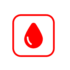
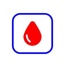
Multiple Icon Colors
You may also want to have multiple colors in your icon, instead of just one. For instance, if we wanted the border of our raindrop icon to be a different color than the droplet.
We’ll first need to make sure that the border path is not combined with the droplet’s path in Figma.
We can still go through the rest of the process as normal, except for when we get to the part where we change the fill attribute to currentColor. Instead of currentColor, we want to use CSS custom properties.
<symbol id="icon-raindrop-separate" viewBox="0 0 24 24" fill="none" xmlns="http://www.w3.org/2000/svg">
  <path fill-rule="evenodd" clip-rule="evenodd" d="M4.81.96A3.85 3.85 0 0 0 .96 4.81v14.38a3.85 3.85 0 0 0 3.85 3.85h14.38a3.85 3.85 0 0 0 3.85-3.85V4.81A3.85 3.85 0 0 0 19.19.96H4.81ZM0 4.81A4.81 4.81 0 0 1 4.81 0h14.38A4.81 4.81 0 0 1 24 4.81v14.38A4.81 4.81 0 0 1 19.19 24H4.81A4.81 4.81 0 0 1 0 19.19V4.81Z" fill="var(--color-1)"/>
  <path fill-rule="evenodd" clip-rule="evenodd" d="M12 19.2a5.33 5.33 0 0 0 5.28-5.37c0-2.03-2.46-6.03-4.02-8.35a1.5 1.5 0 0 0-2.51 0C9.18 7.8 6.72 11.8 6.72 13.83A5.32 5.32 0 0 0 12 19.2Zm-2.88-6.24a.48.48 0 0 0-.96 0c0 1.79.85 3.38 2.13 4.24a.48.48 0 1 0 .54-.8c-1-.66-1.71-1.95-1.71-3.44Z" fill="var(--color-2)"/>
</symbol>
In this case, one path has fill set to var(--color-1) and another path has fill set to var(--color-2).
When we use our icon with the <svg> tag, instead of coloring it with the color attribute, we can set custom properties.
<style>
.icon {
  width: 24px;
  height: 24px;
  --color-1: blue;
  --color-2: red;
}
</style>

...

<svg class="icon">
  <use href="/icons.svg#icon-raindrop-separate" />
</svg>
Adding transitions for these colors takes a little more set up than when we’re just using the color property. We have to use the very-newly-available @property rule to declare what values we’re actually using in our custom property. In our case, we’re setting the syntax to ”<color>”
<style>
@property --color-1 {
  syntax: "<color>";
  inherits: true;
  initial-value: transparent;
}

@property --color-2 {
  syntax: "<color>";
  inherits: true;
  initial-value: transparent;
}

.icon {
  width: 24px;
  height: 24px;
  --color-1: blue;
  --color-2: red;
  transition: --color-1 150ms linear, --color-2 150ms linear;
}
</style>
Final Thoughts
I’m sure there’s ways you can automate this, but do you really want another piece of code to maintain? Another tool that might break?
Almost all of the icons in the apps we create get added once, and are never changed again. I think doing a little bit of manual optimization and composing is fine.
Also, it’s always good to re-evaluate current processes to see how they can be improved. Especially in this case, where the users were suffering with poorer UX. Hopefully this helps you think about how you’re handling SVGs in your apps, and gives you some ideas of how to improve things.
Loved the article? Hated it? Didn’t even read it?
We’d love to hear from you.