
Hey there, fellow Figma enthusiasts! I’m the newest member of the Simple Thread design team, and in this blog post, I’m excited to share six sweet Figma tricks I’ve learned since joining Simple Thread. I’ve been a UX designer for over a decade, but my Figma journey only started about a year and a half ago. I thought I was pretty solid with Figma… until I met Derek, our resident Figma magician. Derek’s Figma-fu is strong, and he showed me that I’d only been scratching the surface. So, after some brain-picking sessions with Derek and a bit of Figma-geeking with our other pros (shout out to Andrew Mowe and Lisa Lombardi), I’ve compiled a list of Figma tips that’ll sharpen your design prowess, boost precision, and give you an organizational edge.
1. Better Ways to Select
Ever found yourself clicking frantically to select something nested within multiple groups? Well it turns out there’s a better way. Enter “Deep Select”! Hold down that command key, and boom, you’ve got your elusive item selected.
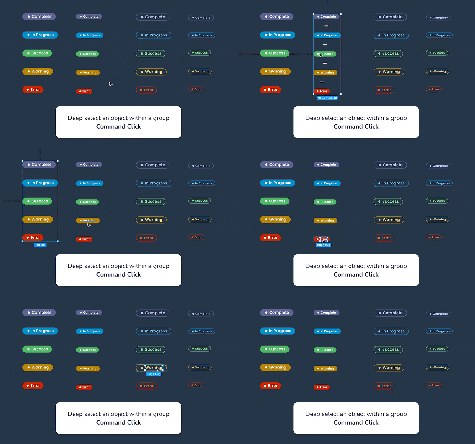
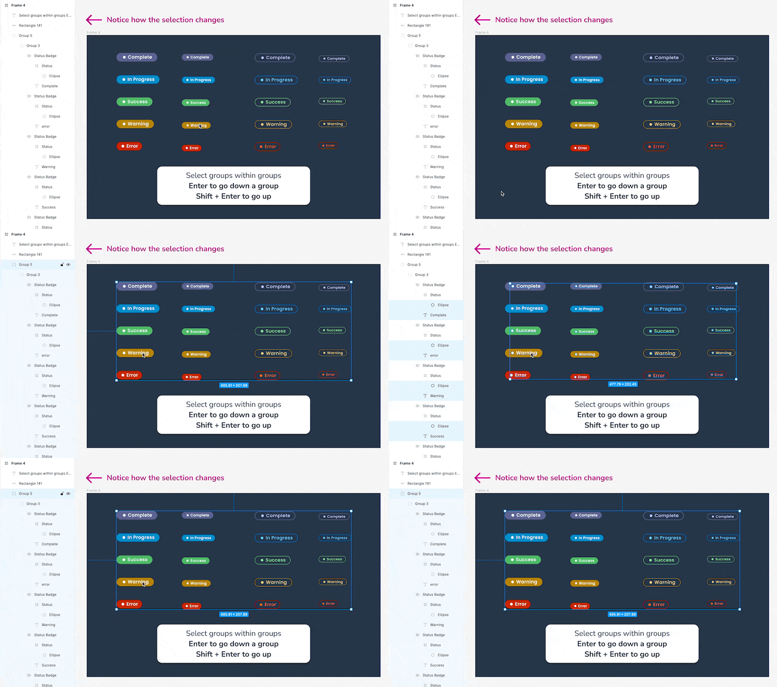
But what if you want to dive deeper and select a group within a group, not just a lonely item? Turns out there’s a solution for that too! Click the group object, then hit enter to drill down to the subgroups. To ascend back, just press Shift+enter. Wham bam, thank you, selection shortcuts.
2. Better Ways to Scale
If you’re like me you’ve experienced the frustration of resizing elements and having things go awry. You just want to make that cute little icon a smidge bigger, but your text doesn’t behave. In my pre-Derek-wisdom days, I’d convert text to vectors to resize it, but no more. Turns out there’s a scale tool! Just press “K” or head to your cursor tool dropdown and select “scale.” Objects with text suddenly become obedient.

3. Better Ways to Navigate
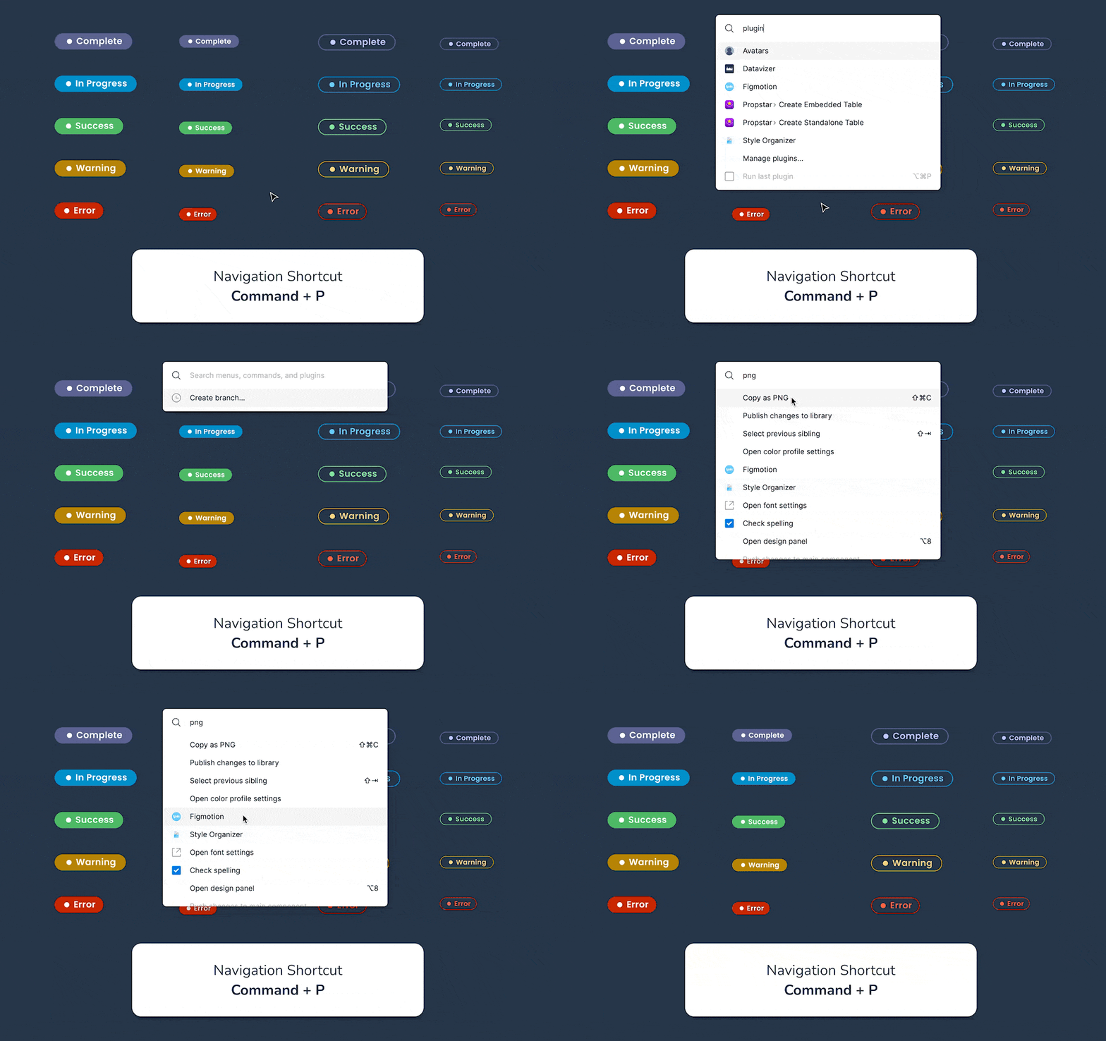
Figma’s navigation works fine, but it’s extensive and not always easy to remember where things live. Enter “Command + P.” It conjures a quick search that lets you locate and open anything from plugins to commands, like creating a PNG or publishing to the library, no menu navigation required. It’s delightfully efficient, and my new favorite shortcut.
4. Better Ways to Organize
In my experience, Figma files can quickly turn into a spaghetti mess of projects, iterations, and features. Well to my delight, the Simple Thread design team has cracked the code on this front. At Simple Thread each project, particularly the very expansive projects, gets defined as a team in our Figmaverse. This allows us to create sub-projects within the team. So for example, one client project might have sub-projects like a design library, feature builds, and marketing and collateral. This allows us to easily segment out and find the work types. The design team also devised a brilliant strategy for maintaining consistency within each design file. Instead of leaving designers to their own devices when creating and naming pages, they’ve developed a design file template with designated pages for the source of truth, prototype, research, and archive. This standardized approach ensures that navigation within each design file remains intuitive and uniform, benefiting the entire team.
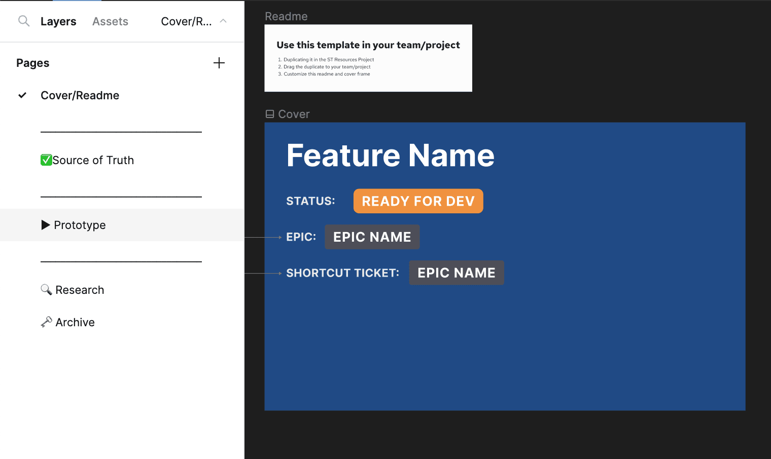
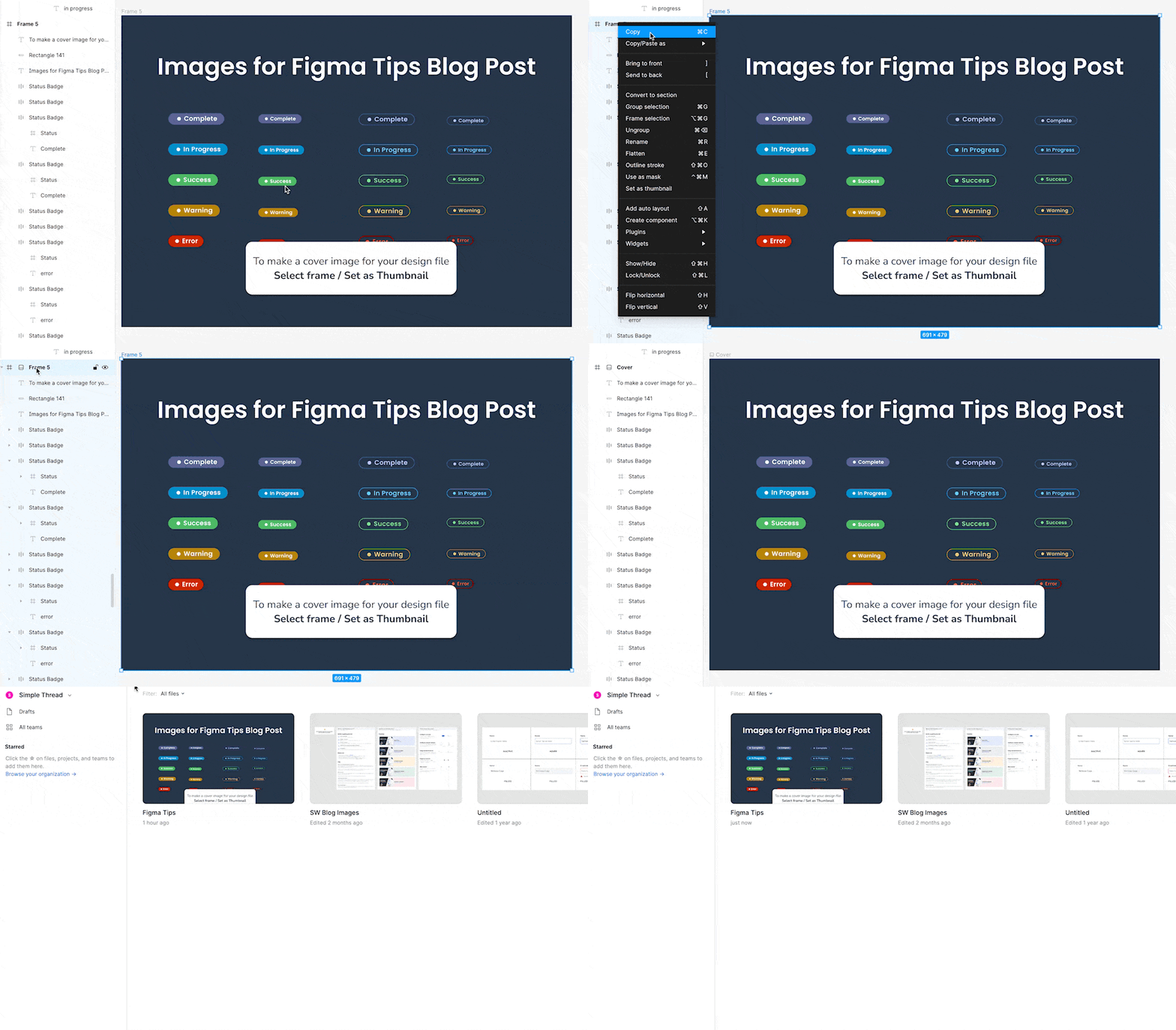
Last but not least, I learned that you can create cover images for your design files to ensure that the snapshot you see in your Figma library helps you easily understand what’s in the file at a glance! Ahhmazing.
5. Better Ways to Iterate
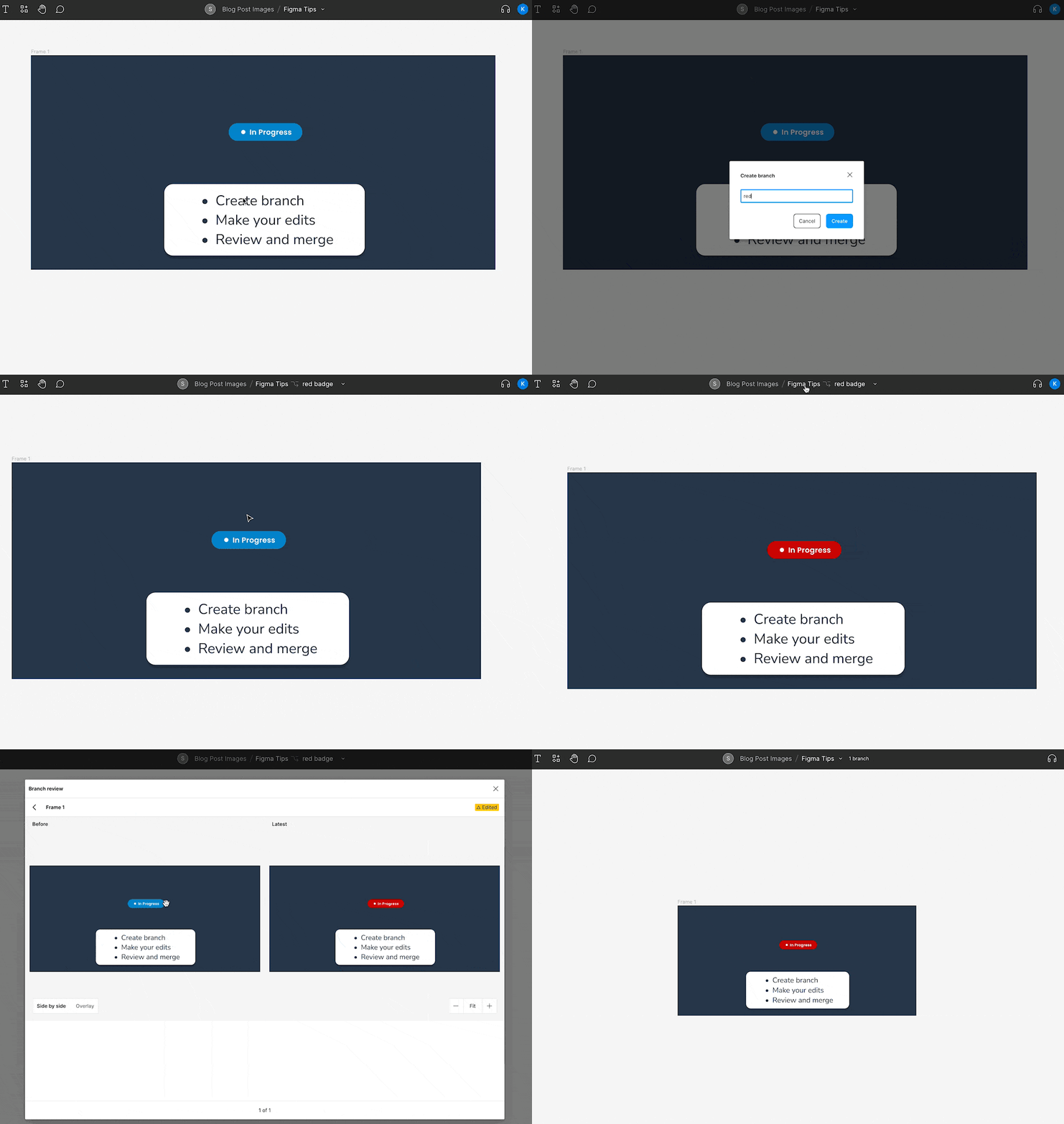
Ever copied an artboard to iterate on a new design, only to end up with a jungle of versions with no source of truth? Figma has a remedy—branching. Just like developers, we can create a branch for fresh iterations, brainstorm like mad without affecting the original, and then merge it back in. You can also submit it for review before making it official if the stakes are high.
To do this, go to the project title navigation (or better yet press Command + P) and select “create branch.” This will create a new branch for you to play in without affecting your original. You’ll see the branch icon up by the title. When you’re ready, click on the title again and click “review and merge.” You can see your before and after changes, select others to review, and merge your changes. Voila!
6. Better Ways to Learn More
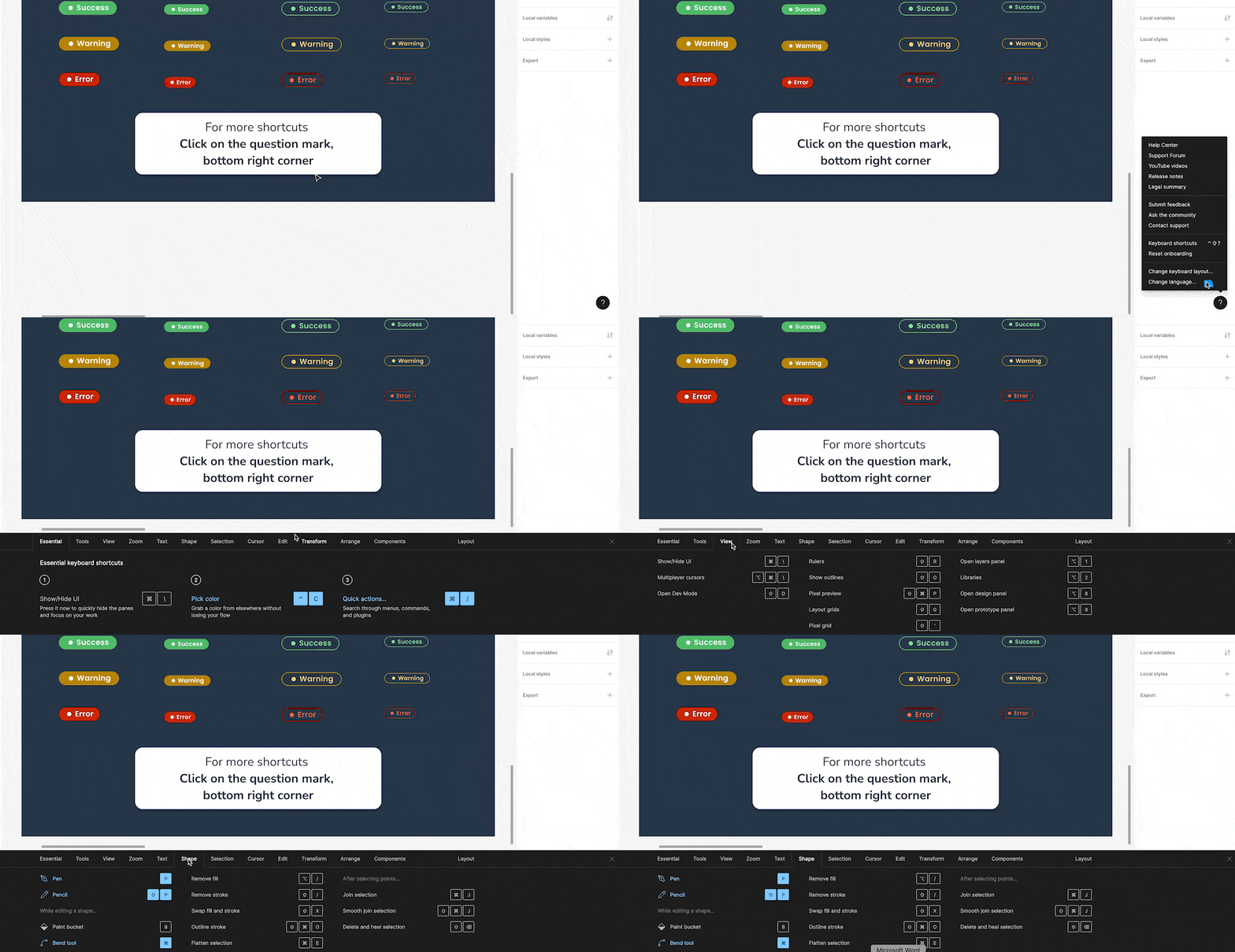
While I’ve been pestering Derek and the Simple Thread design crew for their Figma wisdom, it turns out Figma has a quick and easy shortcut library to help us fledglings spread our wings. They’ve even gamified it – the colors turn blue as you master each one.
So, there you have it, my fellow designers. May these tips streamline your design flow and get you started unlocking the true potential of Figma. Happy Figma-ing! 🪄✨
Loved the article? Hated it? Didn’t even read it?
We’d love to hear from you.


Your work is greatly appreciated, has had a positive impact, and has greatly benefited both myself and my students. Creators like you elevate the educational experience, making it a blissful endeavor for learners across the globe.