I recently had the opportunity to visit my local emergency room (spoiler alert: everything’s fine.) It’s not the kind of thing anyone enjoys, but this experience was particularly obnoxious and it made me start to think about it in terms of User Experience. Pretty handy actually, since I was hard pressed to think of a topic for this blog post before then.
There are lots of things about the medical industrial complex that have room for improvement. The way insurance “works,” forcing doctors to spend less time with patients, leaving you sitting in a room for 40 minutes wondering if you’ve been forgotten. Seriously, I can see exactly where my pizza delivery driver is via GPS but I have no idea if or when a medical professional is going to open that door.
But those are all big problems. These days I’m trying to lower my expectations and focus on problems that are fixable. The little things. Things like signs.
Get lost
Obviously no one is at their best when they feel like something is deeply wrong with them, and I was no different. Worried and confused, my wife drove me the (thankfully) short distance to a nearby hospital while our toddler (not thankfully) screamed in the back seat.
That’s when we saw the sign. As we got closer to the medical campus we came upon a big sign with like 50 items on it and lots of arrows pointing either up or left. Unhelpfully, the different arrows did not look very distinct, especially in the early morning hour we found ourselves in.
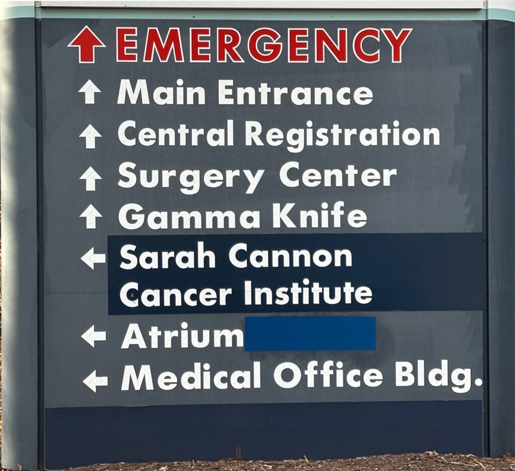
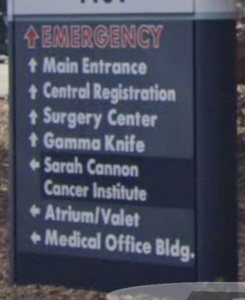
In the cold light of day (and with a head-on, high-res photo), it’s pretty obvious which arrows are pointing up (aka forward) and which ones are pointing left (aka turn here). But that’s not how we saw this sign while driving up to it. A better approximation is how it looks in a Google Street View screenshot, like this one:
And it gets even worse when you consider it was dark and we were driving 30 mph. Here is an artist’s rendition of what that may have looked like:
And think about the hierarchy here. If you are physically driving up to the entrance where this sign is located, the top five places on the list are not here. If you’re looking for a facility that this entrance leads to, you would have to scan past the names of lots of other places that live somewhere else before you find the name you’re looking for. And by then you’ve probably passed the entrance or veered into oncoming traffic since I’m pretty sure reading that amount of text qualifies as distracted driving.
Side note: “Gamma Knife” would be an awesome band name.
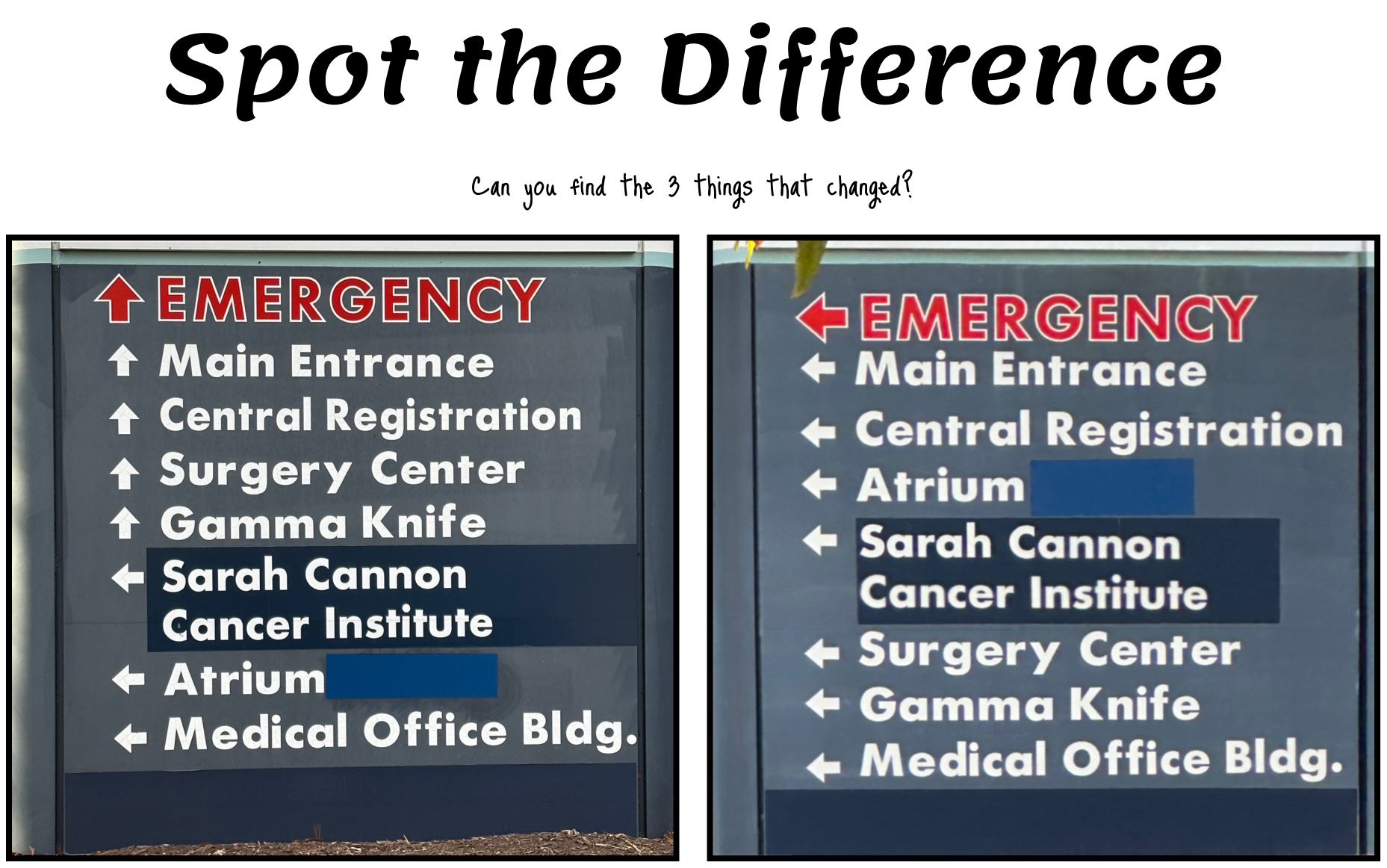
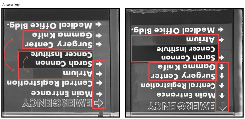
Needless to say, we turned here. We tried valiantly to snake our way through the maze of interlocking parking lots before giving up, going back out to the road, and looking for another entrance. There we found another sign that was almost identical to the previous one while giving ever-so-slightly different directions. Seriously, it’s like a “Spot the Difference” game. (Answer key at the bottom of the page.)
How can we help?
If you want to help people in an emergency get to the place that handles emergencies, it would probably be good to make it clear where they should go. Even if it’s dark and even if they’re not operating at peak performance. There are lots of design terms that could be used to describe the missing piece of the thinking behind signs like this:
- Human-Centered Design: Designing with the user’s entire experience, including their situational and emotional state, in mind.
- Contextual Design: Designing systems that adapt to the user’s specific context, including their environment, goals, and constraints.
- Stress-Case Design: Designing for users in their most vulnerable or high-pressure moments. For example, considering users who are in a state of panic, grief, or stress.
If we apply some of these principles to these hospital signs, what can we tweak to make them easier to use in an emergency? Let’s look at some of the Laws of UX for guidance.
Spread it out
First of all, let’s address how jam-packed everything is on this sign. The many, many words and arrows are all shoved together giving everything a feeling of sameness. In my opinion, there are a few UX Laws at play here:
- Law of Proximity: Objects that are near, or proximate to each other, tend to be grouped together.
- Law of Similarity: The human eye tends to perceive similar elements in a design as a complete picture, shape, or group, even if those elements are separated.
- Law of Uniform Connectedness: Elements that are visually connected are perceived as more related than elements with no connection.
There’s a lot to unpack from these three laws, but the reason I’m highlighting them has to do with the placement of the directional arrows on these signs. The arrows are all bunched together on the lefthand side. This can imply that they are all indicating the same thing, especially since turning left is one of the two options available to the user.
The arrow shape is also problematic. From the angle that a driver would see the sign, the left arrow and the up arrow are too visually similar. With all the information your brain is trying to process while reading this sign in motion, it will look for opportunities to simplify and just lump all these arrow shapes together.
In this case I’m not going to try to fix the iconography. Instead, what if we simply repositioned some of the arrows like this?
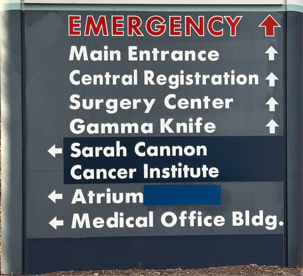
Now we’ve given a visual and meaningful separation of the arrows that are pointing forward and the ones pointing left. This positioning makes it easier to tell that there’s a difference between these groups of places, while also strongly indicating which way to turn to reach said places.
A place for everything
We’ve made some progress, but we still have a lot of stuff to read to know which way to go. Which brings us to our next Law:
Miller’s Law: The average person can only keep 7 (plus or minus 2) items in their working memory.
Right now, the order of places seems somewhat arbitrary. We start with “Emergency,” which makes total sense. That’s a great example of human-centered design that puts the needs of the people with the most time-sensitive problems ahead of all others. But then we have four places that are not accessible from the entrance where this sign is located before we see the three places that are.
What if we instead prioritize the facilities that are accessible from this entrance and put them at the top of the list? That way, people who need to turn left here will be able to make that decision sooner rather than later.
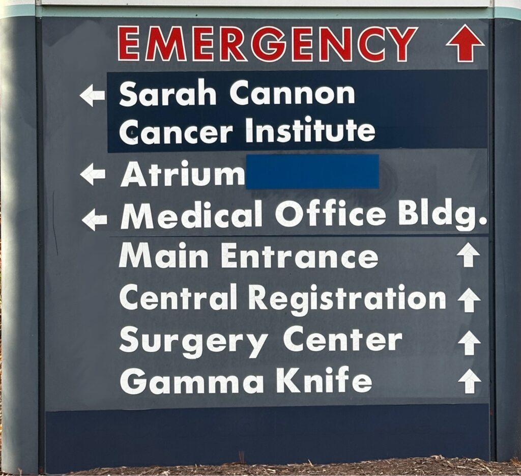
In this case, I would still leave the “Emergency” location at the top since that’s something you really want to be able to see quickly. But “Central Registration” probably isn’t something that needs to grab most people’s attention, especially people in a hurry.
Brevity is the soul of reading comprehension
Ideally, we would also cut this list of places in half (at least) and just focus on the main areas people are likely to be looking for when coming from the main road. The specific facilities could be highlighted on signs within the campus. I’m sure there are marketing aspects to the decision to put certain high profile facilities on the primary signage, but it’s a usability nightmare. So let’s make some cuts:
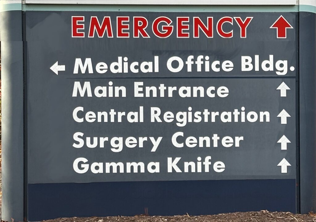
All apologies to the Sarah Cannon Cancer Institute, but removing you from the sign results in a 23.5% reduction in the word count. And do we really need to have a call-out for the Atrium on this sign? An atrium is literally an empty space. In their defense(?), the Atrium used to be paired with the Valet so maybe it was more useful to call out back then. Sharp-eyed readers can still see the Valet referenced in the Google Street View image. But I guess the valet service got the ax, so they covered that word with a piece of blue tape that doesn’t match the rest of the sign at all. So let’s just finish the job and cut the whole line.
Now we’re just left with the “Medical Office Bldg.” as the only item with a left arrow. I would probably recommend tweaking the language here, but I think it gets the point across. “Turn here for assorted medical offices.” Cool, now what about the rest? I think we can do some more cuts:
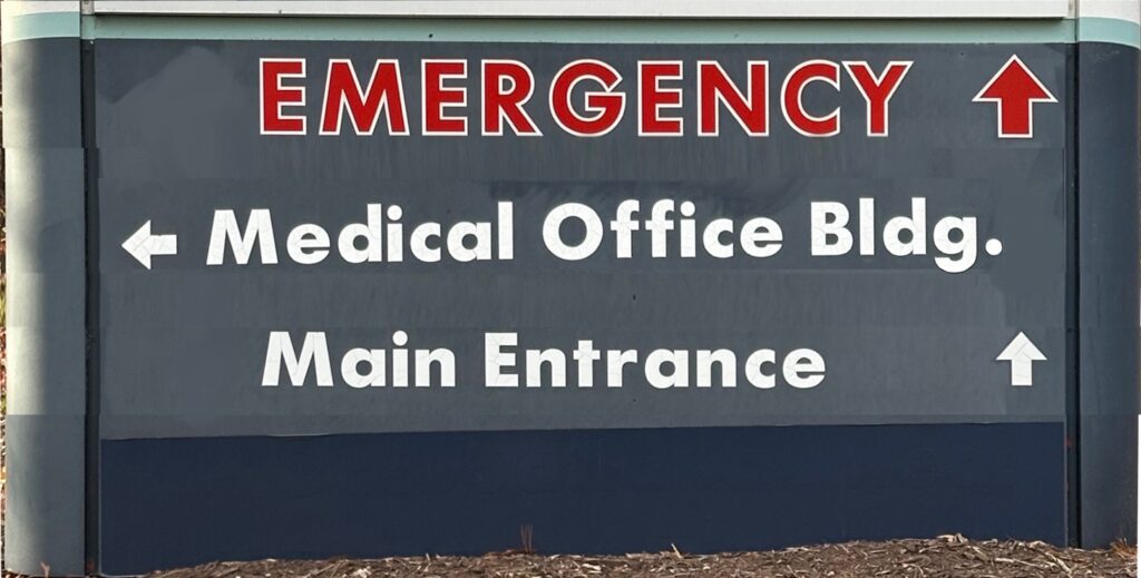
We previously had “Main Entrance” and “Central Registration” as two separate items. Now I’m not exactly sure if these both exist behind the same door but I’m willing to bet that someone at the Main Entrance can point you to Central Registration. They seem like they would be best friends. “Surgery Center” seems like it would be another good friend (or at least an acquaintance) of those two. So just head to the main entrance and I bet you can figure it out from there. And as cool as “Gamma Knife” sounds it probably doesn’t need to be placed on the main entrance sign.
But again, “Gamma Knife” freaking rules.

Back to basics
Aside from those UX concerns, these signs also fail on a basic graphic design front. The text is super chunky causing the letters to bleed together. The blue-gray background makes it hard to notice the sign from a distance, especially in the dark. As previously mentioned, the arrows are not great and take an extra bit of processing power to parse while on the go. And overall there’s just waaay too much text on these things.
So what would I do instead? Well I would look at this other local hospital and steal their sign design.
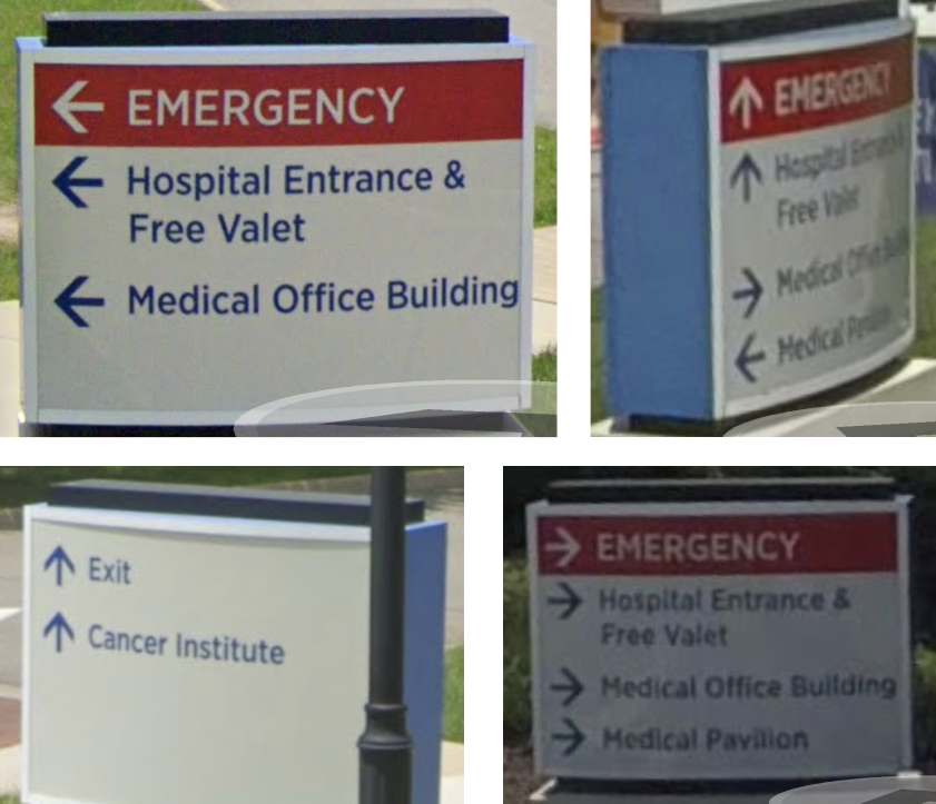
Just look at the simplicity. Even from the grainy Street View images you can figure out where to go pretty darn quickly. Creating usable signs isn’t the most complicated design challenge in the world, but it does require a fair amount of thought. And in a field that literally deals with life and death I would hope that the people who are commissioning these signs would want them to be as easy to use as possible.
Sign design isn’t brain surgery. But you know what is? Gamma Knife is. And it’s really, really cool.
Loved the article? Hated it? Didn’t even read it?
We’d love to hear from you.


