Work in the time of COVID-19 has presented all kinds of challenges. At Simple Thread, we were a fully remote company long before this year, but there were still plenty of adjustments we had to make. One area that has really seen an impact is our UX workshops with clients and users. Activities like card sorting, stakeholder interviews, and job shadowing have some definite trade-offs when conducted completely virtually versus in-person.
One activity that has changed for me in this fully remote atmosphere is the user interview. There is a lot of data that can be gathered during user interviews, but today I’m going to focus on empathy mapping. If you’re not familiar with empathy mapping, it’s a way of gaining more insight into who your users are and what makes them tick. Nielsen Norman Group defines empathy maps this way:
An empathy map is a collaborative visualization used to articulate what we know about a particular type of user. It externalizes knowledge about users in order to 1) create a shared understanding of user needs, and 2) aid in decision making.
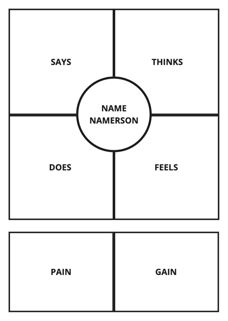
During some recent user interviews, I decided to leverage the fact that we had several team members leading the conversation as well as taking detailed notes, and dive into some real-time empathy mapping as a means of sharing what I heard with my team later. I was able to listen to the conversation with an ear to the empathy map quadrants, shown below.

I found it useful to add extra sections for Pain and Gain to capture specific pain points and opportunities for improvements and new features. These extra sections were also helpful for grabbing snippets of information that didn’t fit neatly into the usual quadrants.
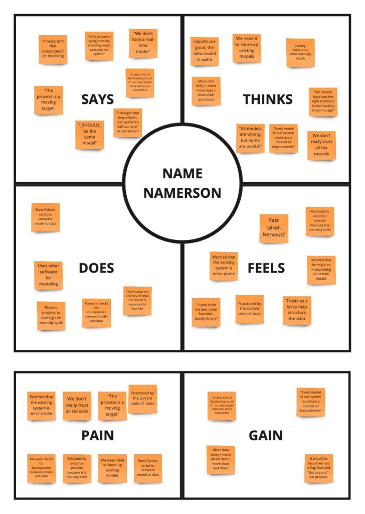
I use Miro for empathy mapping. At Simple Thread, Miro is our virtual whiteboard, and it provides a great space for UX activities. For our recent virtual interviews, I simply created a reusable template for the quadrants and copy/pasted it for each of the users on the call. Then, I dropped in a few empty sticky notes, so I had them ready when I heard something interesting that I wanted to capture.

During these interviews, most of what I heard fit into the Says or Does quadrants. There were lots of statements that highlighted the experiences users go through or their tangible daily activities. In between these more obvious observations, I would listen for what was unsaid. Were they frustrated, annoyed, or despondent about issues they were having? Did they blame themselves, the process, or the tools? Of course, these were only assumptions based on my understanding of what I was hearing, but that’s part of my job – trying to understand the “Why?” behind what people say and do.
There were some pros and cons to doing virtual empathy mapping in real time. One of the downsides was that it was sometimes difficult to keep up with what people were saying. However, since we were recording our Zoom meetings, I could jot down timestamps in my notes and go back over the recording at a later time to get more clarity. Another con was that a lot of our users were a little shy about leaving their cameras on during the interviews. This meant that I lost out on some visual clues about what they were thinking and feeling. On the other hand, they couldn’t see me either, and, as a result, weren’t as conscious that I was taking notes, which took off some of the pressure interviewees may typically experience. Instead, they were free to focus on the questions at hand.
All in all, I think the combination of Miro and Zoom has proven to be a pretty good replacement for in-person user interviews and empathy mapping. There are some drawbacks for sure, but there are also some very real advantages. I can’t tell you how many times I’ve gone back to recordings, cranked up the playback speed, and listened for bits of information I missed the first time around. Although I’ll be glad when we have the option to conduct in-person sessions again, there will always be times when it is expedient or necessary to operate virtually. It’s good to know that our tools are up to the challenge.
Loved the article? Hated it? Didn’t even read it?
We’d love to hear from you.


Hello! To delve into empathy mapping in UI design, I suggest exploring this article: https://gapsystudio.com/blog/empathy-map-ux/