CSS Grid has been out in the wild for a little over five years now. Many developers have avoided using grid until recently due to a lack of cross-browser or legacy browser support. However, CSS grid layout is now supported across all major browsers, going back far enough that there’s frankly no excuse not to use this transformative layout tool.
Let’s take a quick look at some of the history of how this spec came into being. Achieving grid layouts was something that had been tried many times since the inception of CSS, including attempts from CSS creators Bert Bos and Håkon Wium Lie, but had been left as something that was too difficult to accomplish.
It wasn’t until Microsoft was in need of a much more robust layout system for their browser. Microsoft actually included a version of their new grid layout system with the release of IE10 though it was hidden behind an ms- vendor prefix. Microsoft submitted a draft spec which they presented to W3C in 2012. (That’s right, you can thank Microsoft and IE for CSS grid, along with the first AJAX implementation!) The reason this version of grid actually stuck was because developers had something they could actually play with. And play with it they did.
One of the most influential people to start tinkering with the new spec was Rachel Andrew, an invited expert of the W3C, who became determined to push CSS grid into actual use across browsers by demoing the new spec and giving talks on her work. Over time the spec has evolved into what we have today and was released across all new versions of the major browsers in 2017 with the first release of the Edge browser.
Now we have this amazing layout tool at our disposal and we wanted to give you a few quick responsive grid layouts you can easily implement in your projects.
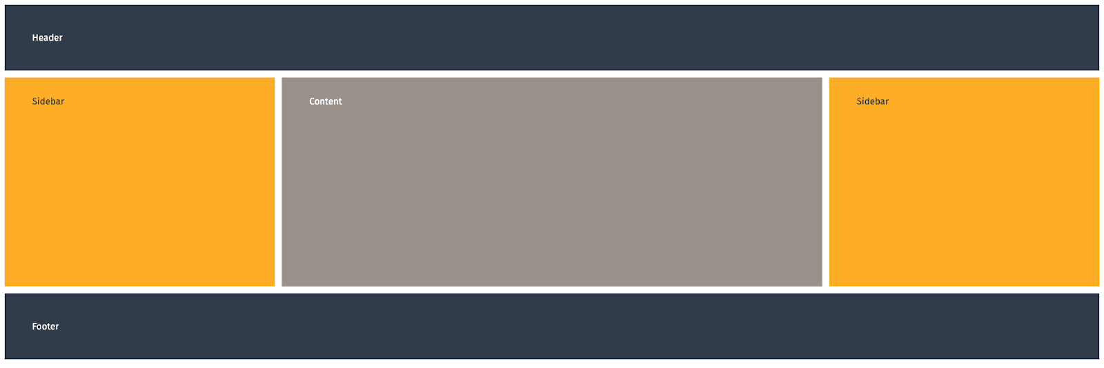
CSS Grid “Holy Grail” Layout

https://codepen.io/heilmannde/pen/ZELdWVm
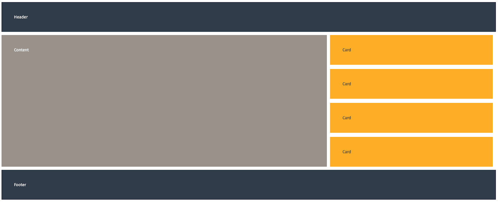
CSS Grid Card Layout

https://codepen.io/heilmannde/pen/yLgdJmN
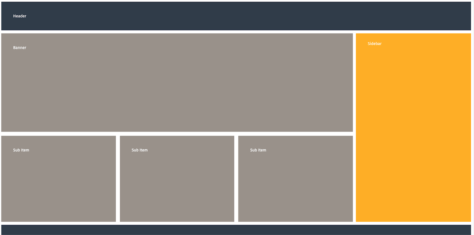
CSS Grid “Publication” Layout

https://codepen.io/heilmannde/pen/PoWrGRM
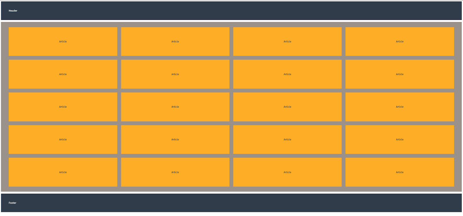
CSS Grid “Gallery” Layout

https://codepen.io/heilmannde/pen/poRXbRY
These example grids may need customizing for your project’s needs, but we hope they provide a good starting point and help you see the power of CSS grid.
If you haven’t made the switch over to using grid layout, now is the perfect time to start exploring it. As always, don’t hesitate to reach out with any questions or feedback.
Loved the article? Hated it? Didn’t even read it?
We’d love to hear from you.


